Week 11 revolved around the testing and evaluation of the Learning Journal, Guide, and Contact webpages. Testing ensures that the website functions correctly, whilst evaluation checks whether the website has met its aims and caters to its audience's requirements.
Code Clean-up
Before testing, HTML and CSS were reviewed in order to simplify their code and monitor its quality. Consistent indentation was implemented to aid code readability thus enhancing its potential use by other web developers. Redundant code such as unused id and class attributes were removed. Removal of these attributes was difficult as they had potential future uses, however, I decided that redundant code would confuse other web developers that may need to work on the Learning Journal website's source. Code was further simplified through techniques such as acknowledging the CSS property inheritance (children inherit from parents) of element selectors, and grouping selectors with similar CSS properties (e.g. th, td {text-align: center;}). Other code-simplification methods included using CSS property shorthand such as setting the margin using a single declaration with values stated in a clockwise order (e.g. margin: 1em 0 1em 0; for the main element selector).
Testing
Testing involved utilising validation tools to ensure all Learning Journal webpages and stylesheets were compliant with W3C HTML and CSS web standards. Validation of the Learning Journal website's stylesheet CSS file revealed some errors that were currently non-web standard features such as vendor-prefixed CSS rules or new features such as position: sticky;. The fall-backs for these were reviewed and found to still provide acceptable website function, so these errors are unlikely to cause major problems (these features will likely benefit users once they become supported in web standards). Other CSS warnings included vendor-prefixed CSS rules, and the "Same color for background-color and border-bottom-color" for elements such as <input> (these were deemed safe as they did not cause visual problems for users, though this will be reviewed in future revisions to the website).
Next, webpage element functions such as links were tested. Testing each link proved repetitive and time-consuming, therefore tools such as the W3C Link Checker were sought after and utilised to provide a more efficient and reliable method to test link functionality on the Learning Journal webpage.
Other elements such as images, videos, and form elements were also tested. All images were checked to ensure that they were web-size (web-optimised to reduce their size and quality in order to decrease their file size and download times). Images were also tested to check that cursor-hover behaviour produced a tooltip to inform the user that the image can be clicked to open a full-size version of the image.
Further validation revealed that the HTML code could be simplified by removing non-essential attributes such as the frameborder attribute of <iframe> and incorporating it in the CSS declaration for the iframe element selector.
Links such as those in the Useful Links sidebar were given the target="_blank" and title="Open in new tab" HTML attribute rules open the link in a new tab or window, and provide a cursor-hover activated tooltip to inform the user of the link's behaviour. These features were implemented because the links in the Useful Links sidebar included reference material and validation tools that are useful to have open alongside the Learning Journal webpage. These features could be extended to the majority of links on the Learning Journal webpage to avoid directing the user away from the Learning Journal webpage, however, these features will first need to be verified through user feedback (this is planned for future revisions of the Learning Journal website).
The Learning Journal website was tested on a variety of common devices including desktop, laptop, tablet, and smartphone. These devices ran a number of the latest common operating systems including Windows 10, Mac OS X El Capitan 10, Android Marshmallow 6, and iOS 9. Google Chrome's Developer Tool's Device Mode was also used to test the Learning Journal's responsive web design on numerous popular device screen sizes in portrait and landscape orientations.
Learning Journal Website on Google Chrome Developer Tool's Device Mode Screenshot
Testing on different platforms uncovered problems such as URL addresses in the references section of the Learning Journal, were breaking the responsive web design by adding additional width to the website on narrow screen. A dont-break-out class resolved similar problems in weeks 1 and 3 where long hyphen-joined sections of text failed to break and continue on a new line. Since these long sections of code were primarily URL addresses, all text URL addresses were wrapped in <a> elements to convert them to functional links, and the word-wrap: break; CSS rule (from the dont-break-out class) was applied to <a> elements. This was repeated with the <code> elements as they also contained long sections of text. This simplified the HTML and CSS code as the dont-break-out class could be removed whilst its word-wrap: break; CSS property was incorporated into existing CSS rules for the <a> and <code>
The Learning Journal was tested on the latest versions of popular computer web browsers including Google Chrome 47, Mozilla Firefox 43, Microsoft Internet Explorer 11, Microsoft Edge 20, Apple Safari 9, and Opera 34. Smartphone web browsers included Google Chrome, Firefox, and Safari (iOS only). This testing ensured the Learning Journal website functioned correctly on a variety of different devices, operating systems, and web browsers.
Learning Journal Website on Android Google Chrome Screenshot
Learning Journal Website on Android Firefox Screenshot
Learning Journal Website on iOS Safari Screenshot
Tools such as Browsershots were utilised in order to rapidly test many different types and versions of browsers to better understand user accessibility.
User accessibility was further tested to ensure that the Learning Journal website provided easy navigation through its structure and presentation. This was done by attempting to navigate the website to simulate pseudo-user behaviour.
Next, disabled user accessibility was considered. This involved ensuring all content such as images were accessible to users with sight impairments This was done by ensuring all images had alternative text specified in the alt attribute. This was then tested by disabling the image src link address and observing the alternative text. A possible solution for other disabilities such as colour blindness could be an alternative stylesheet to adjust the colour scheme to aid visibility of the Learning Journal website's content (this feature is planned and will be implemented if allowed by time constraints).
Evaluation
The creation of the Learning Journal website aimed to meet the following website criteria:
Create a 3-page fully responsive website
Apply web technologies and fundamental web design principles
Create well-formed, accessible and web-standards-compliant webpages:
Learning Journal webpage: A responsive webpage containing weekly blog-style posts that reflect upon learning and link to resources
Guide webpage: A responsive webpage that serves as a Student Guide to something to do in Brighton
HTML5 Contact Form webpage: A responsive webpage containing a contact form to collect feedback from website visitors
Ability based criteria
Use valid, well-formed HTML and CSS media queries to create a fully responsive website
Create an engaging website through creative use of HTML, CSS, and content
Credit all sources via hyperlinks and references
Supplement website creation with independent study
Include insightful and well-documented reflection on website creation and learning in the Learning Journal
Testing and observation of the Learning Journal, Guide, and Contact Me webpage HTML and CSS files revealed that all 4 aforementioned website criteria were met.
For example:
All 3 webpages were fully responsive
Web technologies such as flexbox were utilised, and web design principles were followed (e.g. consistent use of screen-friendly serif font)
Online validation tools and frequent code reviews ensured HTML and CSS were well-formed, accessible (e.g. functional links), and web-standards-compliant. The Learning Journal, Guide, and Contact Me webpages were built specifically to serve their purpose (e.g. Learning Journal webpage contained weekly blog-style posts that reflected upon website creation and learning)
Ability based criteria were also met, for example:
Valid, well-formed HTML and CSS media queries facilitated the responsive web design of the Learning Journal website
Various creative ideas such as code-snippets and image borders were used to make the Learning Journal website more engaging
All sources were credited via hyperlinks and references
Independent study enabled new techniques to be used on the Learning Journal website
Reflection on website creation and learning has been captured in weekly blog-style posts on the Learning Journal webpage
Contemplation of ensuring criteria such as "Create an engaging website through creative use of HTML, CSS, and content" resulted in ideas such as measuring the extent to which the Learning Journal website met aforementioned criteria. One solution was to identify key user requirements, adapting the website to meet these requirements, and collecting user feedback.
User requirements were developed through a combination of online research, pseudo-user simulation (attempting to navigate the website as a user), and user feedback analysis (where data was collected via survey, observation, and interview).
Online research, observation of websites, and pseudo-user simulation revealed potential user requirements such as:
Usability
Ease of use
Memorability and familiarity: User can easily recall how to use the website
Efficient functionality: User can rapidly and flawlessly carry out tasks on the website
Engagement
Attractiveness and appeal
Trust
Search engine ranking
In order to ensure the above user requirements were met effectively, a target audience was identified. The content and aims of the Learning Journal website suggested that its target audience would focus upon new students (especially those with an interest in web development). Thus user feedback would primarily come from the target audience, although other audiences such as current students were included in user feedback to ensure the website was accessible for other audiences.
The SurveyMonkey website was used to create a General Website Experience Survey that was used to gauge the general website experience including aspects such as what users liked and disliked about websites they use. The survey used 4 mandatory questions that generated user feedback as shown in the screenshot below:
The General Website Experience survey showed that users shared a general consensus of preferred website features such as a simple and consistent design, use of colour, clear content organisation, media variety, and ability to share content to social networks. Interestingly, users also shared a general consensus of problematic website features such as pop-up advertisements, which likely obstruct content and forcefully present users with unwanted information.
Combination of user requirement data from online research, observation of websites, pseudo-user simulation, user feedback surveys and interviews highlighted key user requirements for the Learning Journal website:
Usability
Ease of use
Efficient Functionality
Easy access to site information (e.g. site owner)
Simple navigation
Simple, consistent design
Mobile-friendly (responsive web design)
Engagement
Colourful and welcoming design scheme
Rapid, responsive features and fast load times
Ability to share content to social networks
Posts with human aspect (e.g. author name)
References
The Learning Journal website was checked and was found to meet these key user requirements. In order to further tailor the Learning Journal website to the key user requirements, future plans were to incorporate social media buttons, more interactive media, and search and filter features.
A Learning Journal website survey was then crafted to gauge user feedback and further refine the website to its audience. SurveyMonkey was originally used, however, due to problems such as inconsistent user response collection and the cumbersome interface, Google Forms was instead utilised in favour of its simpler interface.
The survey consisted of 3 sections:
Instructions section that introduced users to the survey, provided required information such as a link to the Learning Journal website, and set out its aims
Website Usability section that used simple rated or closed questions to rate various aspects of the Learning Journal website such as ease of use
Website User Experience section that used open ended-questions to ask users their opinion on certain features of the Learning Journal website such as whether text was east to read. This section utilised questions to specifically determine what the user liked and disliked about the website.
The Learning Journal website received strongly positive feedback in the Website Usability section with users sharing a consensus on website aspects such as finding information, ease of use, content, navigation, design, and device use (responsive to screen size).
Generally, users found text easy to read and informative. Design features such as the colours, layout were well received with the simplicity and ease on eyes praised. Users found the Guide webpage engaging and showed appreciation for the variety of media and useful information.
Users emphasised that further improvements could increase user engagement on the Guide webpage, these improvements included adding a map and 360° YouTube video, reducing information and using more lists, reordering sections to improve understanding. I had originally implemented an embedded Google Maps map at 100% width of the wrapper, however, its scroll-zoom control interrupted webpage scrolling on the desktop. This problem was resolved by reducing the map's <iframe> width to 50% thus reducing the chance of the cursor scrolling over the element (especially considering the majority of users are likely right-handed). This was only a partial solution as JavaScript could be used to disable mouse events such as scrolling for specific elements (future plans include the implementation of non-scrolling map <iframe> elements). A 360° YouTube video was also added to the guide webpage in order to embrace a wider variety of website media.
Users showed appreciation for current aspects of the webpage such as the wealth of information, variety of media, reverse chronological ordered posts, and go-to-top links (that enhanced the index section). Users generally admired the minimal colour scheme, however, some users suggested that a more appropriate colour scheme may be able to help users associate the website with either the University or the Brighton Pier (this is another planned feature). For example, a blue banner could provide a more calming appearance, however, further work would need to be done to readjust the colour scheme to complement the blue accent colour.
Other website aspects such as excessive use of text and scrolling to find a go-to-top link, also produced negative user feedback.
A potential solution to the surplus of website text could include using a larger variety of media combined with lists to reduce blocks of text.
Solutions to navigation problems using the position: sticky;, and top: 0; CSS rules to create "sticky" sidebar elements that behaved as position: static; (positioned based on where their code appears in HTML mark-up, known as normal document flow) elements until scrolling caused the element to reached the top of the viewport, at which point the elements behaved as position: fixed; (positioned relative to viewport) elements. The sticky sidebar elements soon produced problems such as preventing some sidebar elements from being visible on smaller screens (e.g. 13" laptops). This was resolved by extending the Index's mobile hamburger menu to desktop thus increasing their visibility, reducing clutter, and allowing users to control when they see the expanded sidebar elements by hovering the cursor over the elements.
Sticky positioning enabled elements to remain accessible to users regardless of scrolling. Sticky positioning was also extended to the navigation bar in order to allow the navigation bar to remain at the top of the screen during scrolling thereby allowing users with access to the other webpages.
Learning Journal Sticky Positioned Navigation Bar and Hamburger Sidebar Menus Screenshot
Subsequent testing of the sticky positioned navigation bar caused complications such as YouTube videos on the Guide webpage overlapping the navigation bar during scrolling. YouTube videos were soon identified to be causing the problem by having a z-index: 12; CSS rule that caused the video to stack last thereby overlapping elements with lower z-index values. This was resolved by adding a z-index: 20; CSS rule to the navigation bar thus allowing it to stack last and overlap the videos.
Sticky navigation also caused other problems such as placing the navigation bar above article titles when the user clicked on a link in the sidebar index. This problem was partially resolved by adjusting the margin-top CSS property of the post's <h3> element to match the height of the navigation bar. However, this produced a large amount of space above post titles, which appeared out of place on the large number of browsers that did not support sticky navigation, therefore the margin-top adjustment was removed. To reach a better suited solution, further research is planned to incorporate features such as making the post's <h3> element and possibly, the <article>element aware of the position of the navigation bar in order to allow the post's <h3> and <article> elements to position themselves below the navigation bar. Such features would likely implement a combination of CSS and JavaScript
Further reflection of the above problems revealed that although sticky-positioned elements improved navigation on the Learning Journal, these benefits were limited to the few browsers such as Firefox, that supported the sticky value for the CSS positionproperty. A potential solution could include using JavaScript to extend the sticky element feature to other browsers.
Further evaluation of the Learning Journal website could include obtaining the opinions and advice of experts in web development (e.g. experienced web designer).
Overall, week 11 was very useful. Code was reviewed and simplified where possible. Testing ensured all website features were functional across multiple operating systems, devices, and web browsers. The website was reviewed in terms of the aims it was built to meet. User feedback on general website use raised awareness of what was acceptable according to user opinions. User feedback on the Learning Journal website revealed the website's strengths and weaknesses. User's website complaints were all reviewed and solutions were formulated, and then either implemented or recorded for future changes to the website. Experience was gained in crafting questions to obtain relevant and constructive user feedback. Existing features were extended (e.g. hamburger menus) and combined with innovative features such as sticky navigation elements in order to enhance website usability and user experience.
Week 11 Summary:
Code Clean-up
HTML and CSS code indentation was adjusted to aid readability
HTML and CSS unused code such as the id attribute were removed to simplify code
CSS property inheritance was respected and redundant CSS code was removed to simplify the code
CSS selectors with similar properties were grouped to simplify code
Shorthand was used to certain CSS properties when possible (e.g. margin: 1em 0 1em 0; for the main element selector)
Testing
Validated Learning Journal website HTML and CSS files to ensure web standard compliancy
Tested website element (e.g. links, images, etc) functionality
Tested Learning Journal website on a variety of operating systems, devices, and web browsers to ensure user accessibility
Evaluation
Reviewed and ensured that Learning Journal website met the criteria (e.g. 3 fully responsive webpages) it was built to achieve
General Website experience survey was used to collect user feedback on what users liked and disliked about website features and identify key user requirements (Learning Journal website was adjusted based on these requirements)
Learning Journal website survey was used to collect user feedback on the website's strengths and weaknesses
User feedback was used to further refine the Learning Journal website by incorporating modification including:
Reorganisation of the Guide webpage's content
Addition of an embedded Google Maps map to the Guide webpage
Addition of a 360° YouTube video
Utilisation of the position: sticky; CSS rule to create sticky elements that enhanced navigation and accessibility
Extension of the narrow screen Learning Journal Index hamburger collapsible menu functionality to the desktop sidebar elements to reduce clutter and ensure sidebar element visibility
Since week 11 is the final week of development on the Learning Journal website, this will be the last post in the Learning Journal.
Thus far I am partially pleased with the Learning Journal website, this is due to the fact that there are many elements and concepts I would like to test and learn about, however, the time constraints prevent their implementation on the Learning Journal website. Nevertheless, the Learning Journal website project has inspired me to continue to undertake new projects and learn in my own time.
Overall, I am pleased with the knowledge and skills I have acquired through the creation of the Learning Journal website.
Week 10 focused on creating the contact form webpage using HTML and CSS.
Websites use forms to collect and send data from users to the website server. Forms are key to enabling useful user interaction. Common examples of website forms include the collection and validation of user login credentials to other useful applications such as processing keywords to provide a search function.
Creating the Basic Contact Form
Creation of the contact me webpage consisted of creating the HTML file and linking the website stylesheet before using the following HTML and CSS code to create the contact form:
HTML and CSS Code for Styling a Clipped Full-size Image:
The above code shows that the basic contact form consisted of a number of form-related elements including:
The <form> element, which contained all form elements
The <fieldset> element, which grouped similar form elements
The <legend> element, which provided a title to indicate what each <fieldset> element contained
The <input> element, which used a type attribute to specify the type of input control used to collect user input
The <label> element, which provided information associated with the <input> element. The <label> element also used a for attribute that corresponded to the id attribute value of an <input> element, thus associating both elements for validation purposes
The <textarea> element, which defined a resizable textbox for text input
The <input> and <label> elements were given the display: block CSS rule in order to ensure they would occupy the width of their container, thus providing a clearer "label followed by input" structure for users.
Various input types were used such as the text (text input), radio (single selection input), and submit (button to send input to website server for validation) input types.
Attributes were used to apply further control to specific elements. These attributes included the required (boolean attribute that defaults to true, thus instructing the browser to ensure the field is contains input), value (sets a default value for an input), and checked (boolean attribute that defaults to true, thus pre-selecting an option from a selection of inputs).
The result of the aforementioned form elements and attributes can be seen in the screenshot below:
HTML 5 offers 13 new form input elements that each have their own user-friendly controls, thereby enabling a greater number of user interactions. Fallbacks for these new inputs includes a plain textbox, thus ensuring user input is always possible. A number of HTML5 form inputs such as date, color, number, and range were tested as shown in the screenshot below:
However, in order to follow the simple style of the Learning Journal webpage, the Contact Me webpage aimed to remain relevant to users by providing them with the form inputs they would require in order to contact the website owner. Therefore, only HTML 5 form inputs relevant to the Contact Me page (such as the range input type) would be used.
HTML 5 Form Validation
Important <input> attributes such as type can be used to ensure users enter correctly formatted data into input controls. For example, type: email will ensure that entered data has the correct format for an email address (i.e. contains an '@' symbol). Other input attributes such as placeholder (provides sample text to display the required input format) assist users prior to validation.
HTML5 form validation helps ensure input data is of the correct type and format before further processing by the website server.
By this point, the contact form was almost complete as shown in the following screenshot:
Partially Complete Contact Form on Contact Me Webpage:
Various CSS rules were applied to the form elements in order to ensure they occupied the correct width and had the correct padding and margins. The submit<input> element was also styled to improve its visibility to users and also provide a different coloured background using the :hover pseudo-class. The display: inline CSS rules was also applied to range and radio<input> elements to ensure that the elements can display on the same line as their <label> elements thus improving their presentation and helping users interpret the interface.
A particular challenge was making the value from the range<input> element display, so that users can see the value they are selecting using the slider input control. After some research I was able to use the <output> element with the oninput attribute to display the value of the slider input.
Further research (such as a Google Image Search) was done in order to gain a better understanding of what types of information contact forms include. Thereafter, my contact form was adjusted accordingly (for example, more placeholder values were used to aid user input).
Other considerations were taken into account, such as making the contact form simpler and more relevant to users. This resulted in the removal of the 3 range<input> elements that asked the user to rate the website's content, layout, and usability. Instead a single range<input> element was used with a <label> element to ask the user how easy they found the contact form to use. A <textarea> element was also used with a <label> element to ask users for suggestions to help improve the contact form.
The completed contact form is shown in the screenshot below:
Future plans for the contact form include the addition of a "reset" button (using the type="reset" attribute for the <input> element). A reset button would provide the user with more control over the form and input data. Other planned features include a cursor-hover activated background colours for the submit and reset button colours (e.g. green background-color for the submit button and red background-color for the reset button). These button background colours would provide users with a visual indication of the action associated with each button, thereby improving the user experience.
Overall, week 10 enabled some basic user interaction on the Contact Me webpage. Many new and important form elements were introduced with some very interesting and equally important attributes. I was also able to conduct some research in order to gain a better understanding of user interaction via forms.
Week 10 Summary:
Learnt about and used many new and important form elements such as <form>, <fieldset>, <label>, and <input>
Learnt about and used important attributes such as checked and placeholder
Added a contact form to Contact Me webpage
Experimented with new HTML5 <input>types such as date, color, and number
Implemented basic HTML5 validation through the use of <input>types such as email in combination with attributes such as required
Added CSS styling to contact form
Researched contact forms in order to better understand and therefore adjust the contact form to be more relevant to users
Created future plans for features such as a reset button and button background colours
Week 9 focused on 2 ways to create a responsive layout. The first used CSS3 multi-columns, whilst the second method utilised the flexbox concept.
Multi-column Layout
A separate HTML file with internal CSS declarations (within the <style> element) was used to experiment with the multi-column layout.
The following HTML and CSS code was used to create the structure for the text content:
HTML and CSS Code for Styling a Clipped Full-size Image:
HTML Code:
<div id="wrapper">
    <article id="red">
        <a id="nav1"></a> <!--Anchor for in-page navigation-->
        <h2>Title 1</h2>
		<img src="image-placeholder.png" />
		<p>Lorem ipsum dolor sit amet, consectetur adipiscing elit. Sed ornare massa eget nunc pharetra congue. Curabitur nisl sapien, hendrerit a nulla ut, vestibulum dapibus nisl. Maecenas viverra vel ligula ut tristique. In viverra erat id fermentum accumsan. Mauris faucibus libero nibh, at sagittis dui volutpat non. Lorem ipsum dolor sit amet, consectetur adipiscing elit. Quisque nunc nunc, vulputate a volutpat non, finibus eu est.</p>
    </article>

    <article id="green">
	    <h2>Title 2</h2>
        <a id="nav2"></a>
		<p>Lorem ipsum dolor sit amet, consectetur adipiscing elit. Sed ornare massa eget nunc pharetra congue. Curabitur nisl sapien, hendrerit a nulla ut, vestibulum dapibus nisl. Maecenas viverra vel ligula ut tristique. In viverra erat id fermentum accumsan. Mauris faucibus libero nibh, at sagittis dui volutpat non. Lorem ipsum dolor sit amet, consectetur adipiscing elit. Quisque nunc nunc, vulputate a volutpat non, finibus eu est.</p>
    </article>

	<article id="blue">
		<h2>Title 3</h2>
		<a id="nav3"></a>
		<p>Lorem ipsum dolor sit amet, consectetur adipiscing elit. Sed ornare massa eget nunc pharetra congue. Curabitur nisl sapien, hendrerit a nulla ut, vestibulum dapibus nisl. Maecenas viverra vel ligula ut tristique. In viverra erat id fermentum accumsan. Mauris faucibus libero nibh, at sagittis dui volutpat non. Lorem ipsum dolor sit amet, consectetur adipiscing elit. Quisque nunc nunc, vulputate a volutpat non, finibus eu est.</p>
    </article>
</div>
CSS Code:
@media screen and (min-width: 50em)
{
	article {
		-webkit-column-count: 2; /*Number of columns*/
		-moz-column-count: 2;
		column-count: 2; /*Unprefixed property future-proofs code*/

		-webkit-column-width: 20em; /*Width of columns*/
		-moz-column-width: 20em;
		column-width: 20em;

		webkit-column-gap:2em; /*Size of gap between columns*/
		moz-column-gap:2em;
		column-gap:2em;
}

/*col-span property is not supported by Mozilla browsers i.e. FireFox
*Makes the heading span both columns*/
	article h2	{
		color: #900;
		-webkit-column-span: all;
		column-span: all;
	}
} /*Media query ends here*/

@media screen and (max-width : 30em)
{
	/*Query targets viewports with the maximum width of 30em*/
	article img	{ display: none; } /*Hides the image so it takes up no space*/
 }

 .clear {
		clear: both;
	}

#red { /* to indicate first article */
	color: red;
}
#green { /* to indicate second article */
	color: green;
}
#blue { /* to indicate third article */
	color: blue;
}
Dummy text (Lorem ipsum ...) was generated using Lipsum Lorem Ipsum generator. The first media query targets screen media types that have a viewport with a minimum width of 50em. Inside the first media query, the col-count: 2 CSS rule specifies 2 as the number of columns that the <article> element should display when the viewport is 50em or greater. The col-gap: 2emCSS rule specifies a gap of 2em between columns.
The <h2> element has the col-span: all CSS rule to enable the heading to span all columns. Note that the vendor-prefixes enable Google Chrome (-webkit-) and Mozilla Firefox (-moz-) web browsers to interpret and apply the currently non-standard CSS rules. The non-vendor-prefixed CSS rules are included to allow browsers to interpret and apply the CSS stylings once the CSS rules are incorporated into the CSS standard, thus future proofing the code.
The second media query targets screen media types with viewports that have a minimum width of 30em, which will apply the display: none CSS rule in order to hide the image, thus enabling narrow screens to better display the text content. The red, green, and blue id's were added for demonstration purposes in order to respectively indicate the first, second, and third <article> elements and their children.
Below is an image that shows the multi-column responsive layout on a narrow screen (left) and wide screen (right).
Multi-column Responsive Layout on a Wide Screen (left) and Narrow Screen (right)
A separate HTML file with internal CSS declarations (within the <style> element) was used to experiment with the flexbox responsive image gallery.
The following HTML and CSS code was used to create the flexbox image gallery:
HTML and CSS Code for Styling a Clipped Full-size Image:
HTML Code:
<div class="gallery">	<!--Div container for the image gallery-->
    <ol class="media">
        <li class="media-item">
            <div class="media-content"> <!--Div for image and heading-->
                <img src="image-placeholder.png" alt=""/>
                <h3>Title - image 1</h3>
            </div>	<!--Close the image div-->
        </li>
        <li class="media-item">
            <div class="media-content">
	        <img src="image-placeholder.png" alt=""/>
	        <h3>Title - image 2</h3>
            </div>
        </li>	<!--Repeat until all images are embedded in the list-->
        <li class="media-item">
            <div class="media-content">
	        <img src="image-placeholder.png" alt=""/>
	        <h3>Title - image 3</h3>
	    </div>
        </li>
        <li class="media-item">
            <div class="media-content">
	        <img src="image-placeholder.png" alt=""/>
	        <h3>Title - image 4</h3>
            </div>
        </li>
        <li class="media-item">
            <div class="media-content">
	        <img src="image-placeholder.png" alt=""/>
	        <h3>Title - image 5</h3>
            </div>
        </li>
        <li class="media-item">
            <div class="media-content">
	        <img src="image-placeholder.png" alt=""/>
	            <h3>Title - image 6</h3>
	    </div>
        </li>
    </ol>	<!--Close the list-->
</div>	<!--Close the gallery container div-->
The flexbox image gallery consisted of a <div> element (of gallery class) that contained an <ol> element (of mediaclass) which contained a <li> element (of media-item class) that contained a <div> ( of media-content class) which contained an <img> element and <h3> element.
The media class was given the display: flex and flex-wrap: wrap CSS rules to allow the <div> container to behave as a flexbox and allow its children to wrap within the container. The media-item class was given the display: flex and width: 100% CSS rules to ensure the <ol> element occupied the width of its container and allowed the <ol> element to behave as a flexbox. A media query that targeted screen media types with a minimum viewport width of 40em applied the width: 50% CSS rule to the media-item class to display 2 columns. Similarly a media query that targeted screen media types with a minimum viewport width of 60em applied the width: 33.33% CSS rule to allow the media-item class to display 3 columns. Finally, the media-content class was given the display: flex, flex-direction, and width: 100% CSS rules to allow it to behave as a flexbox, allow its flexible divisions to be displayed as columns and to span the width of its container. Below is a screen show comparing the flexbox responsive image gallery on a wide screen (left), mid-wide screen (middle), and narrow screen (right):
I have plans to incorporate the multi-column layout into the guide webpage, however, I will first need to consider the total amount of content the guide webpage will contain and whether the multi-column layout would be appropriate for that amount of content.
The next responsive layout technique, however, will almost certainly feature in the guide webpage.
Flexbox Responsive Image Gallery on a Wide Screen (left), Mid-wide screen (middle), and Narrow Screen (right)
When incorporating the flexbox responsive image gallery into the guide webpage, I came across a problem where the flexbox appeared left-aligned, and only 2 columns were displayed when 3 should be displayed on wide screens.
The abnormal flexbox behaviour can be observed in the guide webpage screenshot below:
Problematic Flexbox Responsive Image Gallery on Guide Webpage:
The strange flexbox behaviour led to a few days of investigating each flexbox element and its styling in both the experimental HTML flexbox file, and the guide page HTML and CSS files. This involved comparing the files, making use of Google Chrome's web developer tools, and further online research.
When observing the experimental flexbox, I noticed that applying a 1px border (using the universal selector: * {border: 1px solid red}) to all flexbox elements replicated the odd 2 column flexbox behaviour as seen in the screenshot below:
Experimental Flexbox Responsive Image Gallery Without Border (left) and with Border (right):
The fact that adding a border to all flexbox elements replicated the problematic 2 column flexbox behaviour suggested that a lack of available space was preventing the 3 column layout from correctly displaying. I attempted to resolve this by setting the margin and padding of the media class to 0. However, this failed to address the problem as some padding still remained. Upon realising that my best endeavours were not resolving the problematic flexbox behaviour, I sought help from my lecturer. Her feedback was very useful, however, she needed time to check my code. Thereafter, my lecturer sent an email that explained I would need to set the padding and margins of the media and media li selectors to 0. I followed her advice and quickly understood that the aforementioned extra padding was due to the <li> element within the media div container.
The screenshot below shows that the flexbox on the guide page now displayed correctly:
Fixed Flexbox Responsive Image Gallery on Guide Webpage:
The <div> element with an id of hamburger contained the contents of the hamburger menu. The title for the hamburger menu was placed within a <label> element that also contained an i element which had a class of fa fa-bars fa-2x which works with the <link> element in the HTML file that pointed to Font Awesome (Gandy, no date) which allows the 3 bar vertical stack icon to be displayed.
The <label> was given the display: inline CSS rule to allow the element to display alongside the hamburger icon. The <nav> hamburger element was given the max-height: 0, overflow: hidden, transition: max-height 0.8s to enable the contents of the Learning Journal Index to be hidden on a narrow screen. The hamburger <button> element was also styled to give the correct size. The #hamburger:hover pseudo-selector was given the max-height: 100em CSS rule to allow all elements with the hamburger id to appear when hovered over. Finally, a media query that targeted viewports with a minimum width of 50em applied the display: none CSS rule to hide the hamburger <button> on wide screens.
The hamburger menu can be observed in the narrow screen screenshot below:
Overall, week 9 was able to offer many useful lessons such as introducing 2 new responsive layouts (multi-column and flexbox responsive layouts). Furthermore, week 9 provided an opportunity to review the CSS box model and gain better insight into how padding and margins play an important role in correctly displaying the flexbox responsive layout.
Week 9 Summary:
Learnt about 2 new responsive layout techniques (multi-column and flexbox responsive layouts)
Experimented with multi-column responsive layouts
Experimented with flexbox responsive layouts
Added flexbox responsive image gallery to guide webpage
Resolved problematic flexbox behaviour problems on guide webpage
Week 8 focused on using various techniques in order to make media (such as images and videos) flexible as part of the responsive website design.
Each technique was used on a HTML document called "Flexible media.html" that was saved outside of the website folder to keep file separate from the Learning Journal website. This provided a place to store code that can be later reused and also ensured that the code could be safely tested outside of the website.
Since the flexible media techniques would be used on a single HTML file, it was possible to use internal CSS declarations (within the <style> element that was contained in the <head> element). This also provided the added convenience of storing the CSS and HTML code within one file.
The flexible media HTML file was placed within its own folder (named "flexible_media") within my Web drive and an images folder was created within the flexible_media folder.
Flexible Media Technique 1: Styling a Clipped Full-size Image
The first flexible media technique aimed to style an image to "clip" (hide) a section of the image when it overlapped with another element.
Before styling, I found a copyright-free image using a Usage rights-filtered Google image search, which is shown below:
The image was resized and used for each flexible image technique to provide consistency when observing the effect of flexible media techniques.
The image was embedded in the HTML document as an <img> element with its width and height attributes specified
The <img> element was placed within the <header> element which had the class banner-clipped. This class was given the CSS rule overflow: hidden which instructs the element to hide content when overlapped with another element, thus giving a clipped appearance to the content of the <img> element.
The HMTL and CSS code below shows how the clipped full-size image was created:
HTML and CSS Code for Styling a Clipped Full-size Image:
The image on the left of the above screenshot shows an image as full size when the browser viewport is wider than the image and its container. In contrast, the image on the right of the screenshot is displayed as "clipped" as the browser viewport is narrower than the image and its container thus causing an overlap that the overflow: hidden CSS rule instructs to hide.
Flexible Media Technique 2: Styling a Flexible Image
The second technique involved removing the width and height attributes specified in the <img> element. A banner-fluid class was added to the <img> element and given the following CSS rules:
width: 100% allows the <img> element to display as 100% of the browser viewport width and thus resize accordingly
max-width CSS rule was set to ensure that the image is not resized beyond its original size thus preventing quality degradation of the image
The HMTL and CSS code below shows how the flexible image was created:
The above screenshot demonstrates that when the browser viewport is wider than the image, the flexible image is displayed full size (the max-width: 900px) CSS rule prevents the image from scaling up beyond its original width). However, when the browser viewport is narrower than the image, the image is scaled down to still occupy 100% of the narrow browser viewport width (this is due to the width: 100% CSS rule).
A key difference between clipped and flexible images is that a narrow browser viewport will cause a clipped image to hide overlapped image content whereas the flexible image will scale down to fit within the specified browser viewport width. This is clearly evident when a narrow browser viewport is applied to the banner image used with these flexible media techniques, as the spots on the banner remain the same size on a clipped image whereas they decrease in size with a flexible image.
This is demonstrated in the screenshot below:
Comparing the Effect of a Narrow Browser Viewports on Clipped (left) and Flexible (right) Images:
Flexible Media Technique 3: Styling a Flexible Image with Wrapping
Technique 3 aimed to style a flexible image and <p> element so that text can wrap around the flexible image whilst ensuring both elements are still responsive to the browser viewport width.
This was achieved by placing the <img>, <p> elements within a <article> element. The <img> element received 3 CSS rules:
float: left to move the element to the left
width: 33% to make the element to take up 33% of the browser viewport width thus making it responsive
max-width: 900px to ensure the image does not scale above its original size
Finally, the clear class was given the CSS rule clear: both to clear the float specified by the <img> element.
The HMTL and CSS code below shows how the flexible image was created:
HTML and CSS Code for Styling a Flexible Image with Wrapping:
HTML Code:
<article>

	<img src="images/banner.jpg" alt="Text description of the image"/>

	<p>Lorem ipsum dolor sit amet, consectetuer adipiscing elit, sed diam nonummy
	nibh euismod tincidunt ut laoreet dolore magna aliquam erat volutpat.
	Ut wisi enim ad minim veniam, quis nostrud exerci tation ullamcorper suscipit
	lobortis nisl ut aliquip ex ea commodo consequat. etc. etc. etc.</p>

	<div class="clear"></div>

</article>
On the left the above screenshot, the flexible image with wrapping is floated to the left. Since the browser viewport width is greater than the image, the image is displayed at 33% of the browser viewport width whilst the <p> element is displayed on the right. However, on the right of the screenshot, the browser viewport width is smaller than the image, causing the image to scale down to fit to 33% of the browser width. Particularly interesting is that the text within the <p> element wraps around the flexible image. This is because the <img> and <p> elements are contained within the <article> element. Although the <div> element is not visible, the effect of its clear class will clear the <img> element's float: left CSS rule thereby ensuring subsequent elements display according to the normal flow of the HTML document.
Flexible Media Technique 4: Styling a Flexible Video Container
Technique 4 aimed to style a flexible video container.
This was done by finding an appropriate video from the popular video-sharing website, YouTube.
The video shown below was found and used for technique 4:
An Embedded Video using an <iframe> within a Flexible Video Container:
Navigating to the Share then Embed sections yielded the HTML code (shown below) required to embed the video in webpage: <iframe width="560" height="315" src=https://www.youtube.com/embed/TrduBSGtkS4 allowfullscreen></iframe>
The <iframe> element shown above was not responsive to the browser viewport width and thus required 2 other elements in order to acquire a responsive nature. This was achieved by placing the <iframe> within a <div> element with the class video-container that was then placed in another div element with the class video-wrapper
The <iframe> element and classes applied to the <div> element were then styled in order to ensure that the <iframe> element responded to 100% of the browser viewport width, whilst the video-container maintained the 16:9 video aspect ratio via its padding-bottom
The HTML and CSS code to achieve the flexible video container is outline below:
HTML and CSS Code for Styling a Flexible Image with Wrapping:
On the left of the above screenshot, the browser viewport is wider than the original size of the<iframe> element, so the <iframe>and video-container span the width of the browser viewport (this is due to the width: 100%) CSS rule that is set for the <iframe> element and video-container. However, on the right of the screenshot, the browser viewport is smaller than the original size of the <iframe> element but again due to the aforementioned width: 100% CSS rule, the <iframe> element is able to respond to the browser viewport width whilst the video-container maintains the 16:9 video aspect ratio.
Other Adjustments to the Learning Journal Webpage
Other adjustments were attempted to further improve the Learning Journal with respect to content, presentation and user experience. These improvements were based on my reflection on the webpage.
Examples of the Learning Journal improvements are given in a non-exhaustive list below:
Examples of Improvements to the Learning Journal:
Changed the font of all text content (headers and paragraphs) to the "Roboto" font. This drastic change was made in order to provide a clearer and more consistent font to aid text legibility throughout the webpage (Roboto uses a cleaner font with more straight edges than the previously used Arial font).
The Roboto font was linked to through Google Web Fonts in a similar fashion that the "Lobster" font was (The Lobster font link has been maintained in the Learning Journal HTML file in anticipation of its potential use in the future)
Orange borders were applied to linked images through the a:hover CSS pseudo-selector. This provided a visual indication of linked images that provided more interactive user interaction. The orange border colour was selected to maintain the consistent use of the orange accent colour that is used throughout the website. These hover-activated orange image borders also provided a contrast to the presentational grey borders already applied to <img> elements through the bordered-img class
A particularly challenging change to the Learning Journal was adding a logo to the webpage banner. This involved find an image and using it to create a logo for the webpage. I initially had some trouble with the size of the image as it inherited the width: 100% CSS rule for all <img> elements. This was resolved with the use of an id attribute that was used to target the logo image and reduce its width percentage in order to display the image at the correct size (the image was also resized using an image editor such as Microsoft Paint).
After achieving the correct size for the logo, I wanted to position the logo to the left of the webpage's main heading. Again, this was difficult at first as I had to experiment with the logo in various ways. This ranged from setting the logo image as the background of the <h1> element to using the CSS float property and adjusting the margin, and padding CSS properties for the <img> element.
Eventually I was able to achieve the correct position using the following HTML and CSS code shown below:
HTML and CSS Code for Styling the Learning Journal Banner Logo:
The code above shows how the logo was sized and positioned within the webpage banner for wide screens. The margin was used in a crude way to quickly achieve the desired positioning for the logo, however, the position: relative and directional CSS rules could be used to interrupt the normal flow of the document and position the <img> element without affecting its margins.
Below is an image of the website banner with the logo:
Website Banner with Logo at the Desired Size and Position:
I was considering correctly positioning the logo and making adjustments for narrow screen, however, I found the simpler text-only banner to more aesthetically pleasing and relevant for the Learning Journal webpage. Therefore I abandoned incorporating the logo into the website banner.
Upon receiving feedback from my lab tutor and reflecting upon the Learning Journal website and Guide pages, I made plans for potential changes to the website.
These plans (and possibly already implemented changes) are listed below:
Plans to add more content focused on my independent study and their effects on the design of the Learning Journal
Plans to add reading references with correct formatting
Plans to reformat internet references
Plans to possibly add <code> element to previous week posts
Added more "code snippets" to illustrate and support explanations. Initiative was taken to present these code snippets clearly and consistently, such as:
<blockquote> element
Provide a stylised container to indicate quoted content
<pre> element
Maintain formatting such as whitespace (tab and space characters)
HTML entities
To display angular bracket symbols for tag representation in HTML code
Added more images starting from this week (week 8) with plans to possibly add more images to previous week posts
Added <link> element to <head> element of Guide page HTML file in order to apply the current CSS style rules to the Guide webpage with plans to add further content and possibly implement more interesting designs to the Guide webpage
Added 2 div elements to contain the Learning Journal Index navigation and a newly added "Useful Links" navigation that contained frequently used links ranging from CSS reference material to HTML validation. The useful links navigation was hidden on narrow screens by using the useful links navigation id, "sidebar-content-2" with the general display: none CSS rule, that is then changed to display: block in a media query to make the useful links navigation visible on wide screens
Used the W3C CSS Validation Service to validate the Learning Journal website CSS stylesheet for the first time.
Week 8 Extra - Images
In order to reduce the load time and data usage of the Learning Journal website, images needed to be optimised so that their dimensions are no larger than the maximum width of their container (wrapper div). The quality of images must also be reduced without compromising the image quality.
Optimising images for the web proved to be a challenge as I needed to familiarise with the popular photo editor software, Adobe Photoshop.
Before learning about editing and optimisation in Photoshop, I first worked out the maximum size that images would display on the website. Since the images are contained within the wrapper div, I initially used the wrapper div's width as the maximum width (85.375em = 1366px) for the Learning Journal images. Taking into consideration that the images are in fact contained within the main elements that is styled to have a width of 60% of the wrapper div width, images on the Learning Journal webpage were given a rounded maximum width of 820px (0.6 * 1366px). Conveniently, the guide webpage images were contained in a main element that occupied 100% of the wrapper div width, thus guide webpage images were given a maximum width of 1366px.
Dimension optimisation of the images would then require resizing images that were greater than their given maximum width (where width and height must be adjusted in proportion in order to prevent image distortion).
Part 1 - Editing and Optimising Images for the Web
Before editing website images, I decided to use a sample image for experimentation in Photoshop. A copyright free photo was found using a usage-rights filtered Google Image Search, this image is shown below:
Golden Gate Bridge
Licence: CC0 Public Domain
I experimented with the above image in order to gain knowledge and practice with Photoshop tools. For example, I used the marquee tool in order to select and crop the image, before proceeding to resize the image and apply the image as a layer to a separate canvas of a specified width. Effects such as stroke (to add a stylised image border) and drop shadow (shadow that gives the image a 3D effect). The result of the aforementioned edits is shown below:
Image
Golden Gate Bridge licenced under CC0 Public Domain
In order to ensure images were optimised for the web, they were resized if their dimensions exceeded their given maximum width. Their quality was also reduced to reduce their file size and therefore download times. Screenshot images were saved in the PNG file-type as PNG is able to display images with a smaller colour palette more efficiently whilst also supporting transparency (should it be required). Images such as photographs were saved in the JPG file-type in order to preserve their wider colour palette.
Part 2 - Web Graphics: Colour, Background Images and Favicons
Looking at Colour Palette Generators
Since the Learning Journal has no specific client, I was able to create a simple and consistent colour scheme through observation of popular sites such as YouTube and Amazon. These sites emphasised light grey colours which are easy to view, combined with an attention-grabbing accent colour that users could associate with the website.
Despite being able to create my own colour scheme, using a colour palette generator would ensure that the colours I chose would work together to create a visually appealing design. Some colour palette generators such as the Degraeve Color Palette generator (which generates a colour palette based on a given image) would be very useful considering many clients would likely have a logo or image for their website. However, since I have used a very limited colour scheme (shades of grey with an orange accent colour), I did not make much use of the colour palette generators (although they may be very useful should I want to add more colours that work with my current colour scheme).
Background Images
Background images were also considered for the Learning Journal website. This was done by using the Stripe Generator online tool to create a small image that could be repeated to produce a background pattern. The image was set as the background of the <body> element by using the CSS rules background-image and background-repeat (creating the tiled background pattern). The background-attachment: fixed was also set to ensure the background image did not scroll with content thus providing a more consistent and less disorientating user experience.
The striped background for the Learning Journal webpage is shown in the screenshot below:
Using an Image and CSS Rules to Apply a Background to the Learning Journal Webpage
A background image could also be combined with the link hover pseudo-class to provide visually appealing rollover effects for buttons. However, this was not implemented in my Learning Journal website for 2 reasons:
Images would have to be loaded which would contribute towards the website load times
I wanted the Learning Journal website to maintain a simple and consistent user experience, and solid background colours were more suited to this purpose
Creating a Favicon (website image that appears in the browser navigation bar)
Another logo was created for the Learning Journal website. The logo was made with Logo Maker. This logo was used with Favicon Generator to create the website favicon. The favicon image was linked to the Learning Journal HTML file using the <link> element as shown in the following code: <link rel="shortcut icon" href="images/learning-journal-favicon.ico">
Using CSS3 instead of Digital Images
CSS3 offers many properties that can be used instead of digital images thus improving performance and reducing data usage. Since I was using an image to create a tiled background, I was keen to make use of CSS3's gradient functions. First, I studied a CSS Gradients tutorial from the CSS-TRICKS website. Thereafter the background-image: linear-gradient(#E9EAED, #CCC) CSS rule was used to create a top to bottom linear gradient from #E9EAED (light grey) to #CCC (medium grey). The top to bottom gradient is the default behaviour for the linear-gradient value, and the colours were selected to match the Learning Journal website colour scheme (they also produced a subtle colour gradient that is less distracting yet still interesting to users). The linear-gradient CSS property value has been tested and found to work in the latest versions of Google Chrome, Firefox, Safari, Edge, and Internet Explorer. For older or other browsers, the #background-color: #E9EAED CSS rule has been used to provide a fall-back background colour of #E9EAED (light grey).
CSS3's border-image property allows images to be used to create custom borders that can look fantastic at small border widths. However, the border-image property relies upon the use of an image which will contribute towards page load times and data usage.
The CSS3 box-shadow property allows the display of simulated drop shadows for box elements such as the div elements.
This Learning Journal website attempts to utilise a simple and consistent design where presentation is very subtle in order to emphasise content. Therefore, the border-image and box-shadow properties were not used but may feature in possible future updates to the Learning Journal website.
Below is a screenshot of the Learning Journal in week 8:
Week 8 concluded using the W3C CSS Validation Service to perform the first CSS validation on the Learning Journal website CSS stylesheet.
A screenshot of the CSS validation result is displayed below:
Screenshot of the CSS Validation Result for the Learning Journal Website Stylesheet:
Overall, week 8 was very useful as it provided an opportunity to learn and practise various techniques to make existing website multimedia such as images appear more responsive whilst also enabling the incorporation of new multimedia such as embedded videos that are adjusted to also be responsive to different screen sizes.
In addition, I was able to observe my Learning Journal webpage more closely in order to identify potential changes (some of which were implemented whilst others were noted for future plans) that would benefit the website content, structure, presentation, and user experience.
Week 8 Summary:
Practiced using 4 flexible media techniques:
Styled a clipped full-size image (overlapped content is hidden)
Styled a flexible image (image scales relative to viewport width)
Styled a flexible image with wrapping (text wraps around floated, flexible image)
Styled a flexible video container (contained and maintained the 16:9 aspect ratio of the width-flexible <iframe> element)
Reflected on website and used lab tutor feedback to make plans for future changes (some of which have been implemented):
Changed font-family of all text to the clearer, more consistent Roboto font
Added hover-activated orange borders to linked i<img> elements to improve user interaction
Added website banner logo, gained insight into positioning; removed banner logo to maintain simple and consistent website banner
Added more images with plans to maintain this trend
Added code snippets using a combination of the <blockquote> and <pre> elements with HTML entities
Linked website CSS stylesheet to Guide webpage
Validated website CSS stylesheet
Edited and optimised images for the web:
Practiced and learnt about image editing and optimisation in Photoshop
Reduced dimensions and file-size of Learning Journal and Guide webpage images in order to optimise the images for the web
Investigated web graphics:
Tested background-image and background-repeat CSS properties
Created a favicon and complementary logo for Learning Journal website
Used linear-gradient CSS3 value to create a subtle top to bottom and light-to-medium grey gradient for Learning Journal background-image (background-color CSS rules was used to implement a fall-back background colour of light grey)
Observed border-image and box-shadow CSS properties
Week 7 focused on applying a responsive website design to the Learning Journal webpage by adjusting some HTML and most CSS styling used for the website.
Since responsive design was entirely new, I decided to do some independent research on the internet in order to better understand what responsive design was and how to best implement it.
I also did some reading from recommended textbook, Learning Responsive Web Design: A Beginner’s Guide. I found chapter 1 particularly useful as I was able gain a better understanding of responsive web design
Before styling the layout, I created a draft layout in order to understand what the layout for wide and narrow screen would look like. This involved first sketching a rough outline for narrow screens that clearly showed the sections of the Learning Journal webpage and where they would go in order to create the webpage layout. This sketch was then adapted for wide screen devices. Both sketches were recreated using the Microsoft Visio drawing program in order to illustrate the website layout as seen in the image below:
Narrow and Wide Screen Wireframes for the Learning Journal Webpage:
As the above image shows, both wireframes follow a basic layout that includes 5 sections: banner, menu, contents, posts, references, and footer sections.
Since the website was build mobile-first, this general layout is displayed as a single column (no floated elements) on narrow screen devices. Whereas wide screen devices would receive a 2 column layout. This would be achieved by having the contents and posts sections floated right and left respectively, whilst the references sections clears the float to display the references and footer as a single column.
This dual layout would enable the Learning Journal to possess a responsive website design, however, this would require a number of steps in order to achieve.
These steps are outlined in the list below:
Addition of the viewport meta element: <meta name="viewport" content="width=device-width, initial-scale=1">
to the <head> element of the HTML document to instruct mobile browsers to display the web page using the full width of the device screen
Adjustment of the HTML elements <main> element (containing the posts — the post section) and the <aside> elements (<main> element was placed between the Learning Journal contents section and references section which were both <aside> elements). This enabled the correct vertical stacking of elements on narrow screens.
Reorganisation of the CSS stylesheet into sections: Base Styles, Layout Styles, Menu Navigation, Media Queries, Float/Clear sections
Styling of menu class elements: <ul>, <li>, and <a> within <nav> in order to create a menu that appeared as a set of stacked block links
Creation of media query for wide screens: @media (min-width: 55em) {}
is a media query that activates the CSS style declarations that it contains when it detects a viewport greater than 55em (880px). This media query contained elements such as the <main>, <aside>, and aforementioned menu elements in order to style these elements for wide screens. Of particular interest are the <main> and <aside> which were floated left and right respectively (an id was used to exclude the references section from the float). In order to allow the references section and footer to display as a single column, the float was cleared by using a clear: both CSS rule for the references <aside> elements.
Another important aspect of the wide screen layout is that the menu <a> elements were set to display inline (on the same line) rather than as blocks
Images were made flexible by removing the width and height attributes previously specified in the <img> element, and instead the <width: 100%> CSS rule was used to set the width of the element to 100%. This enabled the image to adjust its size relative to the given screen width
The table in week 3 was also made responsive to screen width by nesting the <table> element within a <div> element that was given the aptly named id, "table-container". The table-container id was given the CSS rule <width: 100%> to make it responsive to the screen width. The table-container was also given the CSS rule overflow-y: auto to display a scrollbar for overflowing elements
During the process of making the Learning Journal webpage responsive, I found that the card based design I had implemented in week 4 complicated the process of organising and targeting various elements. I noticed that this was due to the accumulation of unnecessarily nested containers and their associated id's and classes.
In order to resolve the problem I altered and reorganised the HTML document and its CSS stylesheet for the Learning Journal webpage. This was a long and bewildering experience as I had to examine each element and its CSS styling.
Once I had made these adjustments, I implemented the aforementioned steps to make the website responsive. By this point, the overall presentation of the reworked website no longer incorporated the card based design that I believed would provide users with a simple, understandable and relatable design. So I attempted to recreate the design whilst using <div> containers, id's, and classes sparingly. During this process I had extreme difficulty adjusting the position of elements, despite having an understanding of the CSS box model in terms of padding and margin.
I made use of online video and tutorials to improve my understanding of and gain some practice with the CSS box model. I then focused my efforts again on the presentation of the Learning Journal webpage, however, I was overwhelmed by the sheer complexity generated by more unnecessary containers, id's and classes. I also found the design aspects of the website such as the layout of the menu, links, and colours did not make the website visually appealing.
To solve the problem, I decided to rebuild the website from scratch, section by section, and was again diligent with the use of containers, id's, classes. I also invested a large amount of time in practicing manipulating the padding and margins of elements. I again struggled with the CSS box model concepts, until I used the universal selector, * {} at the end of the CSS stylesheet to make borders visible around all elements. Through using this technique, I gained an insight into the relationships in the CSS box model. By the end of this process, I was able to use a simplified version of the card based design and also adjust the colour scheme for the banner and menu to provide a consistent user experience. Through the process, I was able to discover and familiarise with a variety of tools ranging from a hex colour code website color-hex to a w3schools em to px converter.
I was able to selectively use the pipe symbol to divide the inline menu for wide screens by using CSS stylings such as the content CSS property and first-child pseudo-class.
Still intrigued by what other HTML and CSS concepts could be used, I discovered and made use of the code element and HTML entities
Below is a screenshot of the wide screen Learning Journal in week 7:
Overall, week 7 was a very interesting week and useful week — especially in the lesson of persistence that it taught. Due to the numerous problems I faced, I was able to learn many new and important concepts. I was able to create a responsive design for the Learning Journal website, and also give it an aesthetically pleasing yet consistent presentation.
Still, further improvements would be added such as making the initial size of images larger (especially in the case of narrow screens).
Week 7 Summary:
Created website wireframes for narrow and wide layouts
Added viewport meta element to <head> element to enable mobile browsers to use the full screen size to display the Learning Journal website
Adjusted HTML <main> and <aside> elements
Set CSS styles for menu for narrow screens
Created media query to display inline menu and 2 column layout for wide screens
Made images and tables responsive
Rebuilt website to simplify HTML and CSS
Practiced CSS box concepts and learnt about various HTML and CSS concepts
Week 6 (Catch-up week) - Creation of the Guide Webpage
Published on
Week 6 was a perfectly timed catch-up week that was utilised to start work on the guide webpage. First, I explored the possible topics of the guide page, and after some research and ideation, I had generated a myriad of topics. However, after considering the fact that the guide webpage served the purpose of being a guide to something in Brighton for prospective students, I narrowed down the topics for the guide page to ensure the information would be both, useful and relevant to its target audience. Thereafter, I focused my efforts on generating content for topics relevant to prospective students of the University. Such topics included advice on how to carry out pre-University preparation that would be useful before beginning University. Other topics revolved around interesting activities and locations around Brighton.
The bulk of my work during week 6 consisted of researching locations and finding appropriate images to supplement the guide page information. This was initially very difficult as I had to locate and familiarise myself with a multitude of resources such as Google Images and scour websites for their terms and conditions regarding usage rights.
Currently my guide page has some content, but is clearly an early work in progress as the following screenshot demonstrates:
Overall, the guide page was initially a very daunting task, however, by doing some research and adding some content, I have managed to build plans to help direct the creation of the guide webpage. Such plans to further develop the guide webpage include adding more content (at least text and images) and using a different, style to help distinguish the guide page and provide an attractive design. Other possible considerations could be investigating more varied forms of content that can be embedded such as video and possibly widgets such as social networking buttons.
Week 6 Summary:
Utilised catch-up week to begin work on the guide webpage
Research and ideated to generate many possible topics for guide webpage content
Narrowed topics to benefit and better cater prospective students of the University
Added 3 sections of content to define the guide page structure
Searched for and familiarised with various resources in order to collect images to supplement the guide webpage content
Created plans to further develop and potentially enhance guide webpage via style an additional content
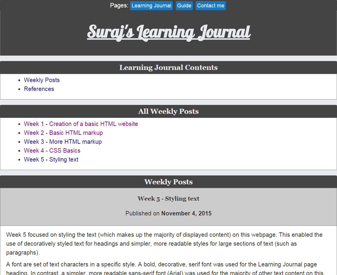
Week 5 focused on styling the text (which makes up the majority of displayed content) on this webpage. This enabled the use of decoratively styled text for headings and simpler, more readable styles for large sections of text (such as paragraphs).
A font is set of text characters in a specific style. A bold, decorative, serif font was used for the Learning Journal page heading. In contrast, a simpler, more readable sans-serif font (Arial) was used for the majority of other text content on this webpage.
Fonts for headers and other text was set using the font-family CSS property and since users may not have the specified fonts, fall-back fonts such as "Georgia" were used with the most preferable listed first. A web-safe fall-back such as serif was also used in case all other specified fonts were inaccessible to users.
An alternative to web-safe fonts are online font libraries such as Google Fonts. The font "Lobster" was used for this website's page header. This was done by using a <link> element to link to the font at the Google Fonts website (Google fonts, no date). This was used for the purpose of providing a decorative page heading, whereas a simpler Arial font is used throughout the rest of the website to ensure the majority of text content is legible and consistent.
New styling was also added to <p> elements such as adjusting the line-height and margin (top and bottom) to create space between paragraph lines and each paragraph block. This increased line spacing ensured better readability.
It is possible to indent the first line of a paragraph to improve the legibility of paragraphs that consist of multiple lines of text. For example, the first line of this paragraph was indented (using an id and the text-indent CSS property) to help a reader's ability to distinguish it from the other lines of this paragraph.
Another useful style that can be applied to text is the "dropcap" style (which has been applied to the first letter of this paragraph). The dropcap style increases the size and add stylistic flair to the first letter of a paragraph (as often seen in printed content such as newspapers). Applying a dropcap style required creating a class selector titled "dropcap", that makes use of the paragraph pseudo-selector first-letter in order to apply various style properties such as float, font-family, and color.
CSS styling was also used to add further structure the text and HTML5 logo image in the week 3 post. This was done by creating a float-right that was applied to a div element that contained the <img> element. A fltlt (float left) class was also applied to the paragraph text that was previously wrapped around the image. The float style property was used to intelligently and conveniently adjust the layout so that the image was floated to right whilst the paragraph text was floated to the right. A clear class that utilised the clear style property was applied to the subsequent paragraph element. The clear property ensured that the subsequent paragraph element was aware of the floated elements and prevented it overlapping the floated elements. Below is a screenshot that demonstrates floating the HTML5 logo image and paragraph elements
After a final mark-up validation, the week 5 web development lab concluded.
For future reference, the current appearance of the Learning Journal webpage is reflected in the screenshot below:
Overall, week 5 was very interesting as it introduced many new concepts such as using a web font library in order to utilise a plethora of fonts and eliminate the need for users to have these fonts installed on their computer. I was able to focus on the aspect of presentational space and how it can be manipulated with CSS (such as the line-height and margin style properties) to aid legibility and improve the overall presentation of text content on the website. Finally, I was able to use the familiar float and clear CSS style properties to effectively layout <img> and <p> elements further enhance the structure and presentation of the Learning Journal webpage.
Week 5 Summary:
Specified font-families (with web-safe fall-backs) for Learning Journal page header, card headings, weekly post headings, and <p> elements
Linked a font-family from Google Fonts web fonts library to specify a decorative font-family for the Learning Journal page header
Used CSS style properties such as line-height to manipulate presentational space in order to aid legibility and improve the overall structure and presentation of the webpage
Used the float and clear CSS style properties to effectively layout image and paragraph elements
Week 4 focused on styling the visual presentation of the webpage HTML elements. In order to do this, a "css" folder was created in the website root directory and a CSS file template titled "boilerplate.css" was added to the folder. The stylesheet was associated with the Learning Journal webpage by using the <link> element (containing href, rel, and type attributes to respectively link to the external CSS stylesheet, state the relationship between the HTML document, and declare the type of the linked file).
The CSS stylesheet contained three rules to override the default stylesheets of older browsers. For example, all HTML5 semantic section elements are specified in this website's external CSS stylesheet to display as block elements (for browsers that don't support HTML5).
A number of CSS selector types were used in order to style this website such as:
Type selectors which match the name of a selector with a HTML element (e.g. p selectors match <p> elements)
ID selectorswhich match the name of a selector with the value of an id attribute (e.g. #card would match an element with an id attribute value of card)
Class selectors which match the selector name with the class attribute value (e.g. .post matches elements with the class attribute value of post)
The CSS selectors used in styling this website included:
body selector
To override the browser's default stylesheets CSS rules and set general CSS rules for all elements and content within the body tags
ID and type selectors for sections
To specify specific styles for groups of sections and styles for each individual section
Various type selectors (e.g. headers, ordered lists, tables)
To specify specific styles for various types of elements
Pseudo-class selectors
To specify specific styles for <a> elements based on its behaviour (e.g. unvisited, visited, hover, and active)
Since web browsers have their own default CSS stylesheets, they may display webpages differently. Furthermore, older browsers do not support HTML5 which presents an inconvenient problem. In order to ensure that this website is displayed consistently across various web browsers (old and new), I have attached a second CSS stylesheet to this website's HTML document to reset browser styles. This second CSS stylesheet is called "normalize.css". The normalize.css download page explains that:
Normalize.css makes browsers render all elements more consistently and in line with modern standards. It precisely targets only the styles that need normalizing
The normalize.css stylesheet <link> element was placed before the boilerplate.css stylesheet <link> element within this website's HTML document. Both CSS stylesheets were placed within a folder titled "css" that is contained within the website root directory.
Styling the Learning Journal with CSS
Styling the Learning Journal with CSS began with the body selector, where property value pairs are used to specify a background-color, font-family, color, font-size, and line-height for the body element and all its children (in effect this styles all displayable elements in the index.html file; this would eventually change once more specific styling to specific elements were implemented).
Similarly, the various header elements were also targeted using a specific type selector to alter their font-family, color, font-size, and line-height. I utilised the paragraph as an experimental tool in order to deduce their most readable and aesthetically pleasing font-family and color. During my experimentation, I settled for simple font-designs such as the Arial font-family.
Stylistic changes were also applied to the div with the wrapper id (which was used to divide the body and content, thus enabling styling of each part). The style changes to the div wrapper content included specifying the max-width, margins of either side, background-color, and padding of either side. Though familiar, I found it useful to remind myself of the auto property value that was used for the margin sides, which enabled the div wrapper content to be centred on the webpage.
One of the most interesting and interactive CSS style changes included using the anchor pseudo-class selectors to apply various color and text-decoration styles to anchor elements depending on their current behaviour state. These anchor behaviour states include:
link: When unvisited
visited: When visited
hover: When hovered over by the cursor
active: When clicked
Note: The order of the anchor behaviour states: link, visited, hover, active (LVHA). This must be reflected in the CSS stylesheet in order to display the correct stylings for each of the four behaviour states.
Since the links would appear as visited once clicked, I used Google Chrome's incognito mode to view all links in their unvisited state (this occurs as the incognito mode does not save browser history whilst in this mode).
Next I moved onto styling the main menu (which contained links to the other sections of the website such as the guide and contact webpages). The menu section was given a general styling by using a compound selector that included the <nav> selector with a class selector value of .menu. Since the menu consisted of <a> elements nested in <li> elements which were nested in the <ul> element that itself was nested within a <nav> element; selectors were used to target the unordered list items and the anchor tags. For example, the list items were set to display as an inline element to ensure they took up the space they required and displayed as a horizontal list (list markers were also removed by setting the list-style-type to none). The menu anchor links were also given different unvisited and hover behaviour state styles that utilised font color, background-color, text-decoration, and padding CSS properties in order to create a button-like appearance.
Finally, class attributes were set to post in the <header> elements that contained each post's header (h3) element. The .post class selectors were then used to target each post's header for styling. Stylistic manipulations to the post headers included changing the margin top and bottom, and background-color. This provided a clear visual division between each weekly post, which is a good example of how HTML and CSS can both be combined to structure content and also improve the visual presentation of the webpage.
Using Independent Research to Better Understand and Style a Design for the Webpage
Up to this point, I had been re-familiarising myself with CSS syntax which helped me become accustomed to CSS styling again. Yet through experimenting with the CSS selectors, I discovered that I was very indecisive with my design choices (for example, with font-family and background-color). It quickly dawned on me that I did not know how I wanted this website to visually appear. Furthermore, I also had limited understanding of colour-schemes and layout which made styling the website appear an even more daunting task.
To resolve the problem, I decided that I needed to formulate a plan consisting of how to design various parts of the website. Firstly, I did some research by observing the design of my favourite and most frequently used websites. These websites included Google, YouTube, Facebook, Twitter, Yahoo, Amazon, EBay, and many other websites. I examined their colour schemes (background-color, font and heading color, anchor behaviour state styles, button styles), font-family, layout, and other design aspects.
Through diligent observation, was able to identify and isolate design and stylistic features that appeared aesthetically pleasing, simple, and easily viewable. I also sought the opinions of acquaintances, and I was able to gradually narrow down a long list of popular websites, and eventually build a design style that would benefit this website's presentation.
Evidence of the design research is reflected in the design and style choices are present on this website. A few CSS style changes that demonstrate this include:
The simple, light grey body background similar to body background or banner background colours found on websites such as YouTube and Google
A card based layout that attempts to create divisions to structure content. Currently this is a work in progress as it would display well on smaller mobile screens once responsive web design is added. However, a layout that takes advantage of larger screens is yet to be implemented
The Arial font-family applied throughout the website to create a consistent and easily readable style to text content
The blue button/card-headers that attempt to capture the users attention whilst providing further structure to the website
Subtle color and text-decoration variations for three of the anchor link behaviour states in order to aid link navigation
Since the appearance of the Learning Journal is anticipated to change as more CSS styling is applied, I decided to include a screenshot below of the website's current appearance for future reference:
CSS was also used for minor changes such as using the attribute value selector, a[href^="#top"] (which targeted all <a> elements with a href attribute value of #top) to add an image (Free graphic resources for everyone, 2016) to the "Go to top" links on Learning Journal webpage. This was done in order to provide users with a visual indication as to what the link does.
A final mark-up validation ensured that all changes did not result in additional errors.
Overall, the week 4 web development lab was very useful in helping me reacquaint myself with CSS and through further experimentation prompted me to improve my understanding of general webpage style and design via independent research.
Week 4 Summary:
Created css folder within website root directory
Added boilerplate.css and normalize.css external stylesheets to css folder and used link tags to associate them with the Learning Journal webpage
Used type, id, class, and pseudo-class CSS selectors to target various elements (such as the body, div wrapper, menu, article post headers/sections, anchor links, and other elements) within the webpage for styling.
Utilised independent research to develop and implement a style and design plan for the website
Week 3 involved learning and using more HTML mark-up elements to further structure and mark-up content in a meaningful and useful manner. Some familiar elements such as <ol> and <ul> elements were further explored in novel ways to create intricately structured content. For example, lists can be nested within each other to provide a hierarchical meaning to content as demonstrated by the unordered list nested within an ordered list below:
Another interesting HTML list is the <dl> (description list) element that is formed of the <dl>, <dt> (description term), and <dd> (term description) elements. The description list is used to structure a list of terms and their definitions as demonstrated below:
A description list built with the description list, description term), and term description elements:
HTML
Hyper-text markup language - markup language used to structure content
CSS
Cascading stylesheets - used to tell browsers how to present HTML elements
JavaScript
Scripting language for adding interactive behaviour to web pages
Tables (constructed from <table> (table), <tr> (table row), <th> (table header), and <td> (table data) tags) are a familiar concept, however, in the past when I first experimented with tables, I used them to layout webpages. I soon realised that these tables rapidly became very confusing, unwieldy, and difficult to maintain when used for webpage layout. Presently, I use tables specifically to structure tabular data as demonstrated by the timetable below:
A timetable created using basic table tags:
Day/time
Monday
Tuesday
Wednesday
Thursday
Friday
09:00 - 10:00
10:00 - 11:00
CI101 lecture
CI101 lab
11:00 - 12:00
CI101 seminar
CI143 lecture
12:00 - 13:00
CI135 lecture
CI112 lecture
CI135 lab
CI153 lecture
13:00 - 14:00
PASS
CI143 tutorial
14:00 - 15:00
PASS
Course review
15:00 - 16:00
CI112 lab
PASS
16:00 - 17:00
CI153 tutorial
17:00 - 18:00
The timetable table above previously had its border CSS property values specified as an in-line CSS (Cascading Style Sheet) statement (within the <table> element) in order to make the table borders visible. I quickly transferred the border property values to an external CSS stylesheet as I found external CSS stylesheets to be easier to manage and apply to multiple webpages.
Another useful element was the <blockquote> element which can contain text content within a block element, and <footer> element (defines a section footer) which contains <cite> elements that reference a creative work as demonstrated in the following blockquote:
Quoting W3C using Blockquote, Footer and Cite Elements:
W3C defines HTML and CSS as:
HTML (the Hypertext Markup Language) and CSS (Cascading Style Sheets) are two of the core technologies for building Web pages. HTML provides the structure of the page, CSS the (visual and aural) layout, for a variety of devices. Along with graphics and scripting, HTML and CSS are the basis of building Web pages...
Quoting resources was a useful tool to credit sources that provided material that facilitated my understanding of web development and the creation of this website. Furthermore, research into quotation mark-up revealed another useful tool: the <quote> element. For example, w3schools succinctly explains that the quote tag Defines a short inline quotation (note that the <quote> element displays its content wrapped in quote marks).
The <img> element was used in week 2 to display images within the webpage, but in week 3, the concept was taken a step further by nesting the <img> element within <a> element in order to create a linked image (user can click on image to be directed to the link contained in the <a> element's href attribute value). The linked image was structurally improved by nesting the <a> element within <p> (paragraph) tags to enable text content to wrap around the image. The <img> element's alt attribute was also utilised to ensure that alternative text is displayed in the place of the image (for cases where browsers are unable to display the image). Below is a demonstration of the HTML5 logo as a linked image (try click the image):
Image Nested Within Anchor Tags to Create a Hyperlinked Image:
The HTML5 logo sports a bold modern appearance that gives HTML5 a visual identity. Naturally, W3C provide a clear description of what HTML5 encompasses:
W3C description of the HTML5 logo:
It stands strong and true, resilient and universal as the markup you write. It shines as bright and as bold as the forward-thinking, dedicated web developers you are. It's the standard's standard, a pennant for progress. And it certainly doesn't use tables for layout. We present an HTML5 logo.
A final mark-up validation concluded the week 3 web development lab by returning a results page that initially yielded an error as the table border CSS property was specified within the <table> element (this incline CSS style statement would later be changed so that an external CSS stylesheet contained all CSS style statements for the website).
Overall, working through the first three web development lab tutorials facilitated my understanding and subsequent use of common HTML tags in order to mark-up and thereby structure text meaningfully within a webpage.
Below is a summary of week 3:
Week 3 Summary:
Added nested and definition description lists
Added table
Added blockquotes
Added a linked image (<img> element nested within <a> element)
Week 2 involved learning and using more HTML mark-up elements. These elements ranged from simple elements such as the <time> element (to mark-up the date of publication for each weekly post) to <ol> element such as the one used to create the ordered list shown below:
New HTML5 elements learned in week 2 of the HTML5 web development lab:
<time>: To mark-up weekly post publication dates
<ol>: To create ordered lists with numbered list markers
<a>: Familiar tag from week 1 that was used for a new purpose in week 2 to link to page sections (e.g. To go to top of webpage)
<img>: To add images to a webpage
<figure>: To mark-up images and allow the <figcaption> element to mark-up images with captions
<email>: To link to the user's email client (with my email address for quick and easy contact)
The <time> element with the datetime attribute (which can take values in the yyyy-mm-dd format; time can values can also be added) were used to add publication dates to posts.
The <ol> element containing <li> (list item) were then used to mark-up and ordered list (where list items have a number list marker). The <ol> element was useful in organising information in a numbered hierarchy. The <ul> element functioned in the same way, however, they use a circle (bullet-point) list marker for list items.
Navigation within the webpage was provided by using the <a> element with href attribute values that pointed to id attribute values in other sections of the webpage. For example when creating a "Go to top" link at the bottom of the page, the anchor tag's href attribute value had to link to the id attribute value of an element at the top of the Learning Journal webpage.
To display images within the webpage, a <figure> element contained <img> and <figcaption> elements in order to mark-up the image and its caption. In addition, after referring to w3schools.com I found that the <small> element could be used to mark-up the copyright text as smaller text.
The <a> element was used with a href attribute value of mailto followed by an email address in order to create an email link that opens the user's email client with the email address pre-filled. This feature was very interesting as it makes contact via email easy by saving the user from having to load their email client and entering the email address.
In week 1 the W3C Markup Validation Service was used to check the mark-up and ensure it was well-formed, and in week 2 an effort was made to frequently use this tool during and at the end of this web development lab session in order to prevent an accumulation of mark-up errors.
In addition, all the HTML mark-up elements that were used in week 2 have proved to be useful tools to better structure and provide useful, meaningful information and features for the learning journal webpage.
Some of these HTML mark-up tags (such as the <ol>, <a>, and <img> elements) were already familiar to me due to previously teaching myself basic HTML prior to this course. Yet despite being familiar, I found using elements for different purposes posed an initial challenge. For example, when creating a "Go to top" link using anchor tags and the href and id attributes. After practice and implementation of these new element uses, I gained experience and found they also enabled new and useful functionality for users (such as allowing a user to easily jump from the bottom of the webpage to the top by clicking a link).
Other elements such as <figure>, <figcaption>, and <email> were entirely new to me. Again, after some practice I was able to understand and utilise these new elements to mark-up content in a useful and meaningful way (such as using <figure> and <figcaption> elements to provide a descriptive caption for an image).
Week 2 Summary:
Used the <time> element and datetime attribute to add publication dates to weekly posts
Used <ol> and <li> elements to add ordered lists to the webpage
Used <a> element with href and id attributes to create navigation within the webpage
Used <figure>, <img>, and <figcaption> elements to mark-up an image with a caption
Used <anchor> element to add an email link to webpage footer
The first web development lab focused upon the creation of the basic website folder structure consisting of a root directory which contained sub-folders and files. This folder structure contained the HTML document files for the Learning Journal, Guide, and Contact webpages which were saved, edited, and linked using the <a> (anchor) elements and their associated <href> address values.
This was done by creating a website folder titled "mysite" within my Web drive (which is on a web server computer that can receive requests from the web browser and send the files that form the website). An "images" folder was created within the mysite folder to contain all image that the website will display or link to. A text file named "index.html" containing the basic HTML document and an identical copy of this file named "guide.html" were placed within the website folder.
Each HTML document contained a variety of HTML mark-up tags such as:
HTML5 <!DOCTYPE html> declaration element: Tells the browser the document is a HTML document
HTML5 semantic section containers (e.g. <header>, <section>, <footer>, etc elements): To group and contain similar elements and content into sections
Headers (<h1> to <h6>): To define headings that vary in boldness and size depending on their importance
<p> element: For blocks of text that span the width of a browser viewport
... And many more!
I also investigated specific tags within the HTML documents by using HTML5 Doctor as reference. For example, I found that the <nav> element contains hyperlinks to provide navigation for the user.
Observation of the HTML documents revealed a general structure consisting of:
Doctype declaration
<html> element containing:
<head> element (contains all HTML document data, which is data about the HTML document)
<body> section (contains all displayed data)
Using the DOCTYPES and mark-up styles guide I was able learn that the <!DOCTYPE> declaration element informs the web browsers that the document is a HTML document. I was also able to observe some past variations of the doctype declaration tag such as the HTML 4.01 doctype which appears more complex than the HTML5 doctype and does not allow presentational mark-up.
I also learned that XHTML 1.0 Strict Syntax promotes well-formed mark-up, which reduces the chance of a webpage not displaying or functioning correctly.
All utilised HTML mark-up tags were required in order to correctly structure the content displayed on the webpage. The website folder structure was needed as it allowed all website files and folders to be stored in a single location. Below is an image of the website folder structure:
The href attribute values and <a> elements within the <ul> element were changed so that the user can be directed from one page to the other when these links were clicked (i.e. from the Learning Journal page to the Guide page and vice-versa) whilst avoiding recursion (so that the user does not click a link that redirects them to the same page). For example, within the <ul> element of this Learning Journal page is the list item “Suraj’s HTML Learning Journal” without the <a> element whilst the “Guide” list item is wrapped in the <a> element in order to direct the user to the Guide page of the website (the Guide page’s HTML document was also adjusted in a similar fashion). Below is a code-snippet of the HTML mark-up that shows the <a> element within the <ul> element:
Using the <a> element to provide hyperlink navigation from the Learning Journal webpage to the Guide, and Contact webpages:
Relative link addresses (where the full address path is omitted and instead includes navigation from the current webpage to another file within the same website folder structure) were used as both webpages are internal (contained within the same website folder structure).
Alterations to the Learning Journal were also made such as the inclusion of a webpage title by adding content text to the title tags within the <header> element. Content was also added to other sections of the Learning Journal webpage such as text and <a> elements in the references section (absolute href address values were used as a full address is required to reach these external webpages since they are not contained within this website's website folder).
Using the website's index.html absolute link address (index.html), I was able to frequently view the Learning Journal webpage through the internet browser viewport in order to check the effect of mark-up changes on the structure of the webpage.
After the foundations of the website (Website Folder structure and files) were created, the Uniform Resource Locator (URL or hyperlink, which links from one file to another) for the Learning Journal and Guide webpages were validated using W3C Markup Validation Service. This process checked for mark-up errors in the HTML documents. Since I ran the validation after making many changes to the website files, I was presented with a validation results page that displayed many mark-up errors that had accumulated through the process. Interestingly, most of the errors were resolved after fixing the first few errors (such as unclosed tags). Nonetheless, I learned that frequently running a mark-up validation check throughout the editing process is essential to reduce the accumulation of mark-up errors.
Below is a screenshot of the mark-up validation results after fixing all errors:
Checking HTML Mark-up Validation using W3C Markup Validation Service:
In order to review and better understand elements such as <body>, <p>, and <ul>, I read chapters 1 to 4 from the recommended text book, "HTML & CSS: Design and build web sites" by Jon Duckett. Reviewing relevant content whether new or familiar, when combined with subsequent practice helped solidify my understanding of the various concepts, elements, and attributes.
Creating the website involved selecting and familiarising with specific tools as this was required in order aid the manipulation of the website files. These specific tools included a web browser, text editor, and File Transfer Protocol (FTP) software. With a wide range of options for each of these tools I opted for those that I was familiar with (Google Chrome web browser, and Notepad++ text editor) and those are recommended by the university FileZilla FTP). I also ensured that I tested my website on various web browsers to observe any changes, these included common web browsers such as Google Chrome, Firefox, Internet Explorer, Safari, and Opera.
In order to access my Web Drive and continue working on the website files remotely (when not using the computers in the Watts IT Suite), I made use of the FTP client software, FileZilla.
I found using the FTP client to be very confusing initially. For example, despite using the correct host, username, password, and port details, I had trouble signing in to my Web drive. However, I quickly realised this was because I had accidentally downloaded the FTP Server rather than the client. Other issues with the software included the fact that I was unable to get the "drag and drop" functionality to work, but I did manage to edit the files my temporarily downloading the files, editing them, and saving them back to the Web drive. Furthermore, adjusting which programs opened specific file-types such as .html or .css was perplexing, but exploring the settings did eventually reveal the file-type associations. Overall, the FileZilla FTP client was initially a bewildering program, however, with persistence and exploration, the program proved invaluable in its ability to assist in editing the website files.
Overall, week 1 was very interesting as it provided me a chance to create the foundations for the Learning Journal website. I also enjoyed covering familiar concepts such as the general HTML document structure, and unfamiliar concepts such as using a FTP client.
Below I've used an ordered list to provide a brief summary of week 1:
Week 1 Summarised in an Ordered List:
Created folder containing website .html files on my Web$ workspace on the itsuite server
Linked two internal web pages together using <a> element and relative href attribute values within an <ul> element in order to form a navigation menu
Created links to external links using absolute hyperlink values
Utilised <header> element to define and organise the website structure
Used the <title> element within the <header> element to edit the webpage title
Added content to various sections of the webpage to observe how HTML elements structured the webpage content
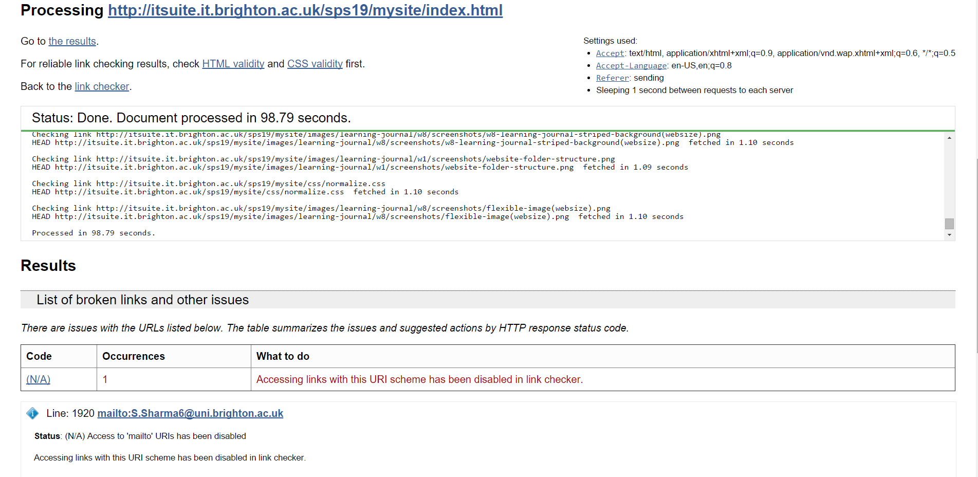
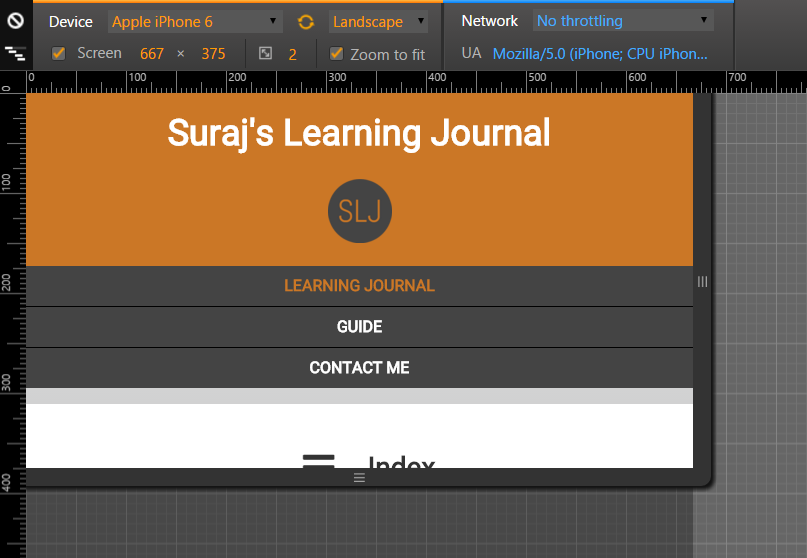
.png) Learning Journal Website on Android Google Chrome Screenshot
Learning Journal Website on Android Google Chrome Screenshot
.png) Learning Journal Website on Android Firefox Screenshot
Learning Journal Website on Android Firefox Screenshot
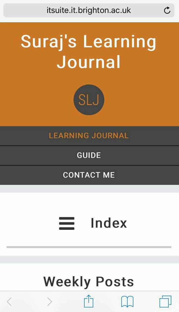 Learning Journal Website on iOS Safari Screenshot
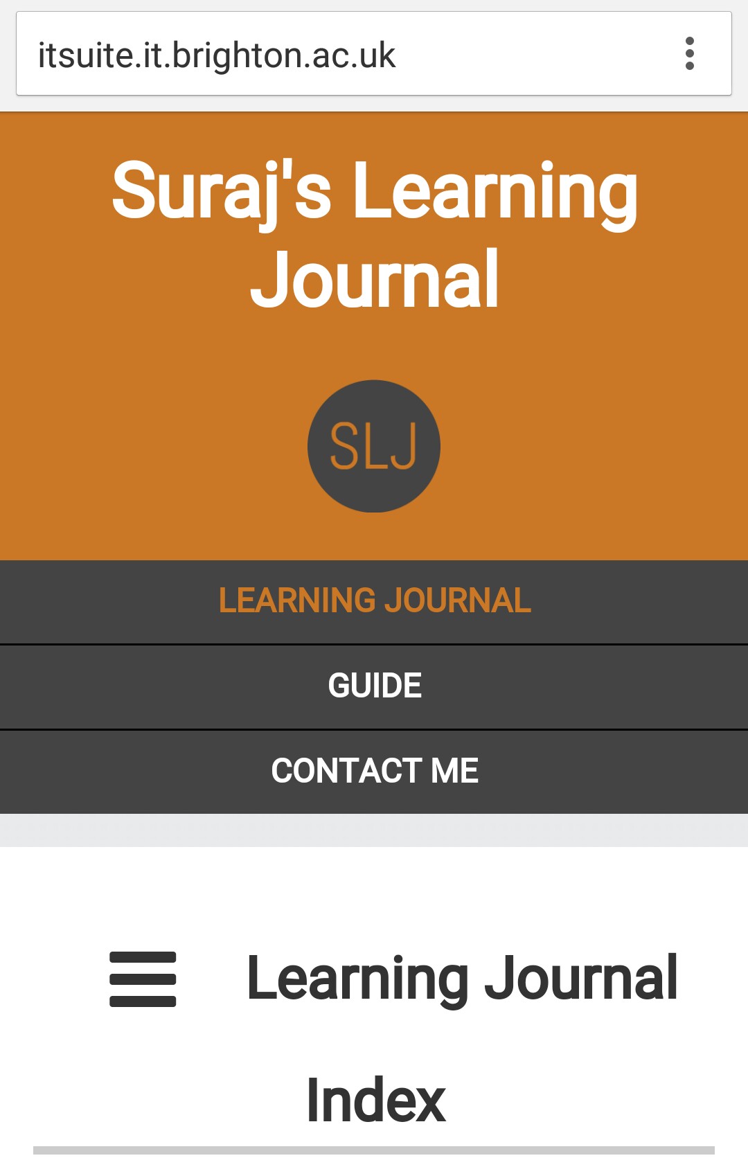
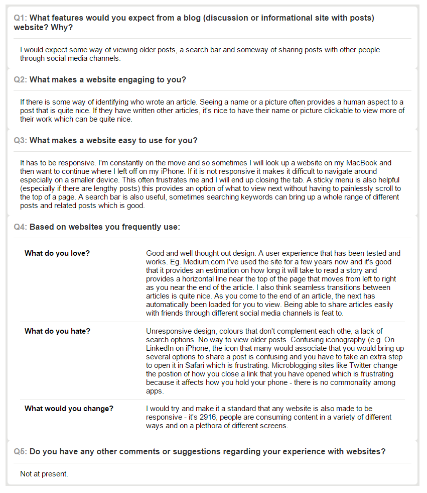
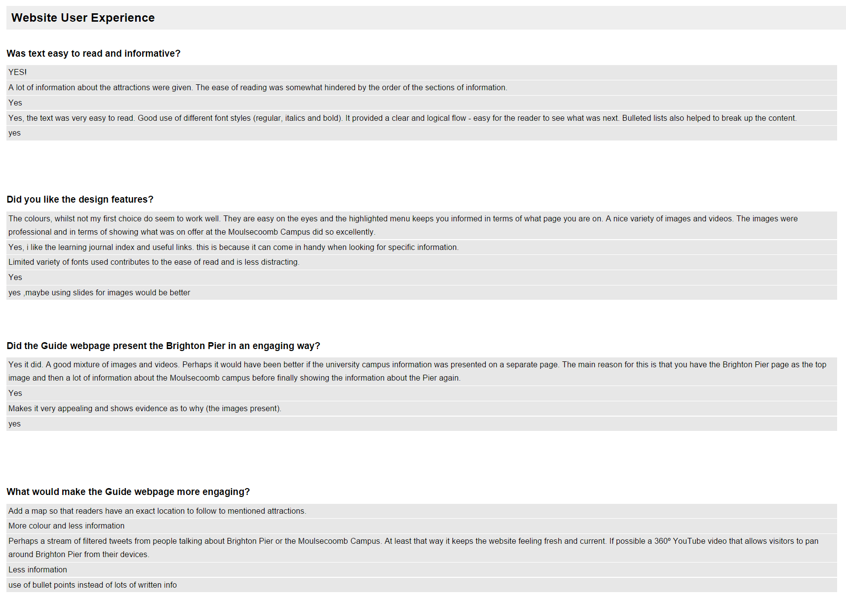

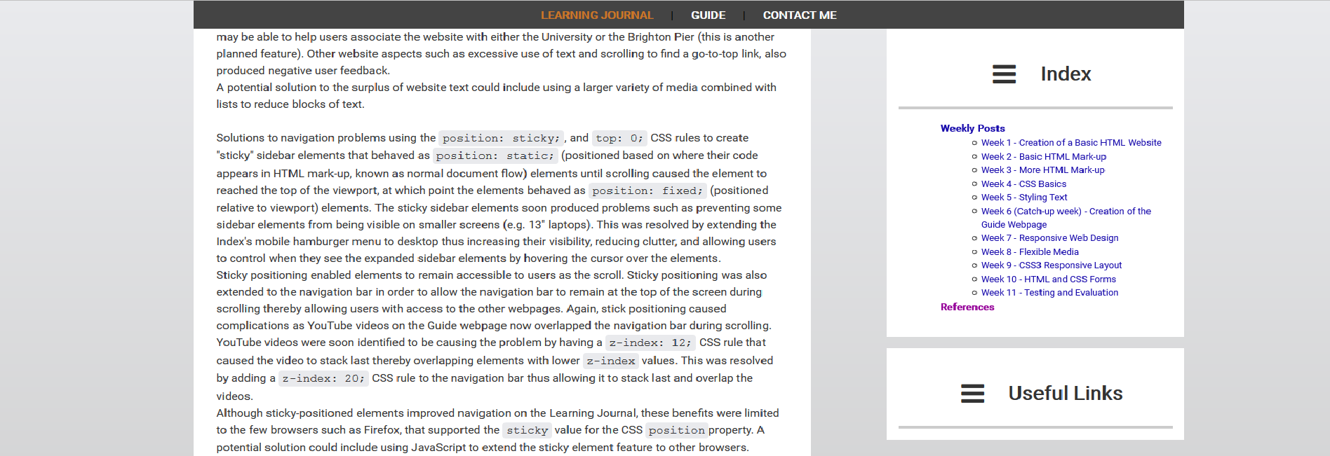
.png) Wide Screen Learning Journal Webpage Screenshot
Wide Screen Learning Journal Webpage Screenshot
.png) Wide Screen Guide Webpage Screenshot
Wide Screen Guide Webpage Screenshot
.png) Wide Contact Me Webpage Screenshot
Wide Contact Me Webpage Screenshot
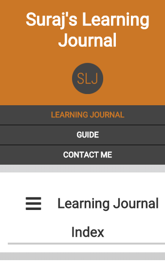 Narrow Screen Learning Journal Webpage Screenshot
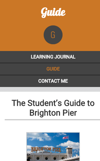 Narrow Screen Guide Webpage Screenshot
 Narrow Contact Me Webpage Screenshot
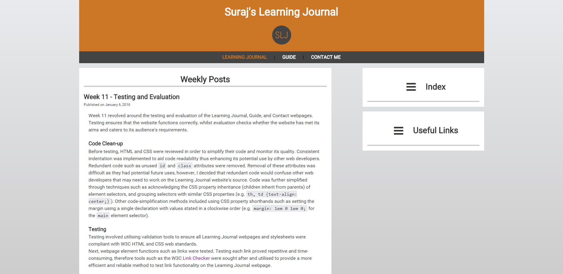
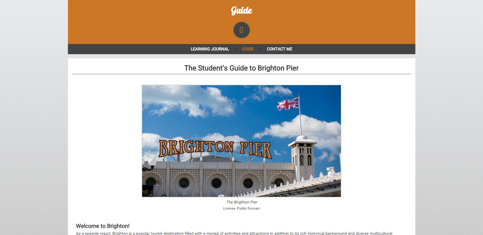
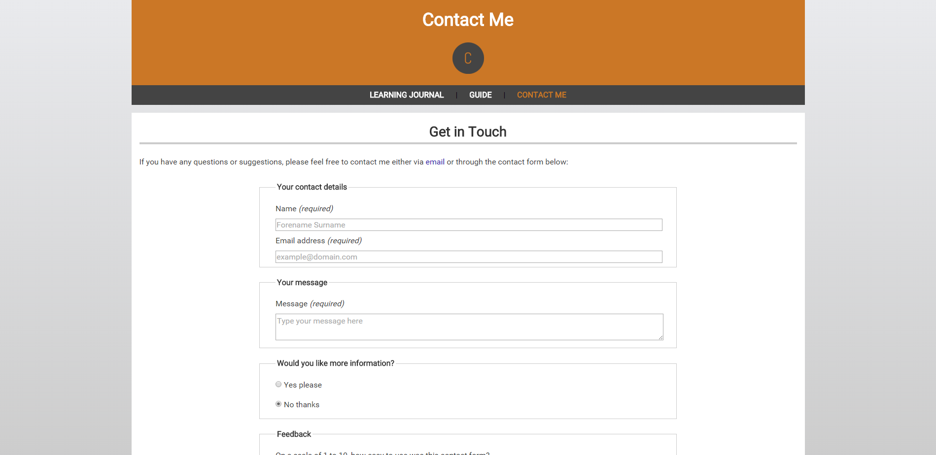
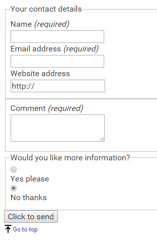
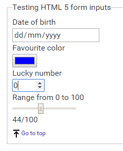
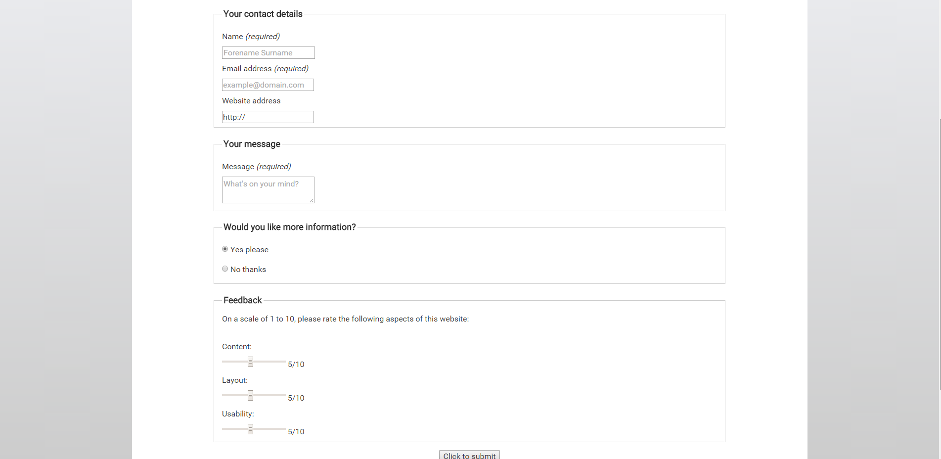
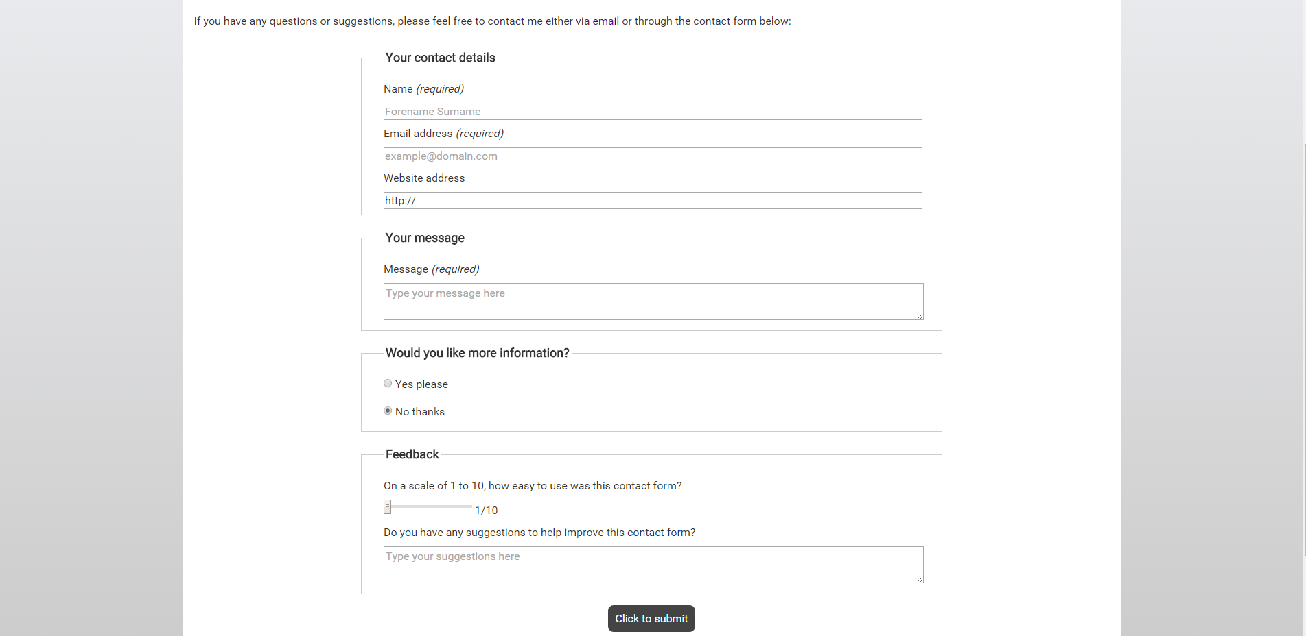
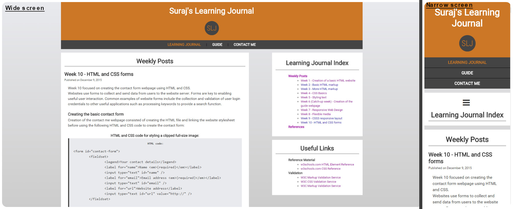
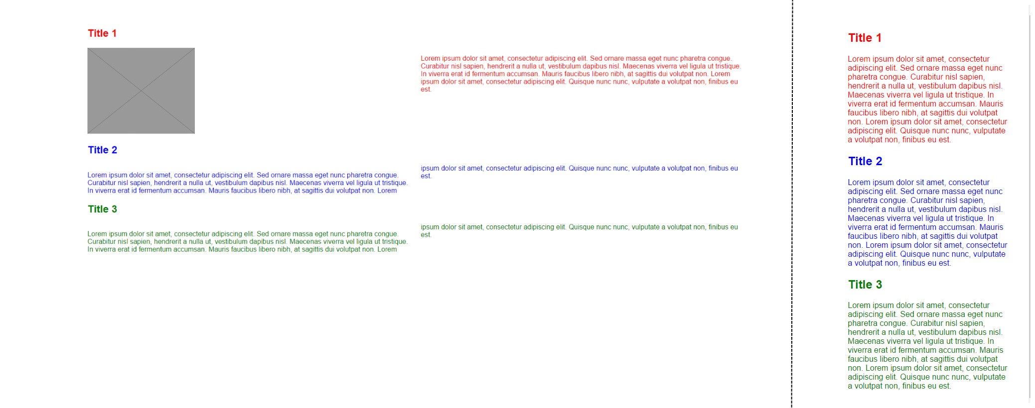
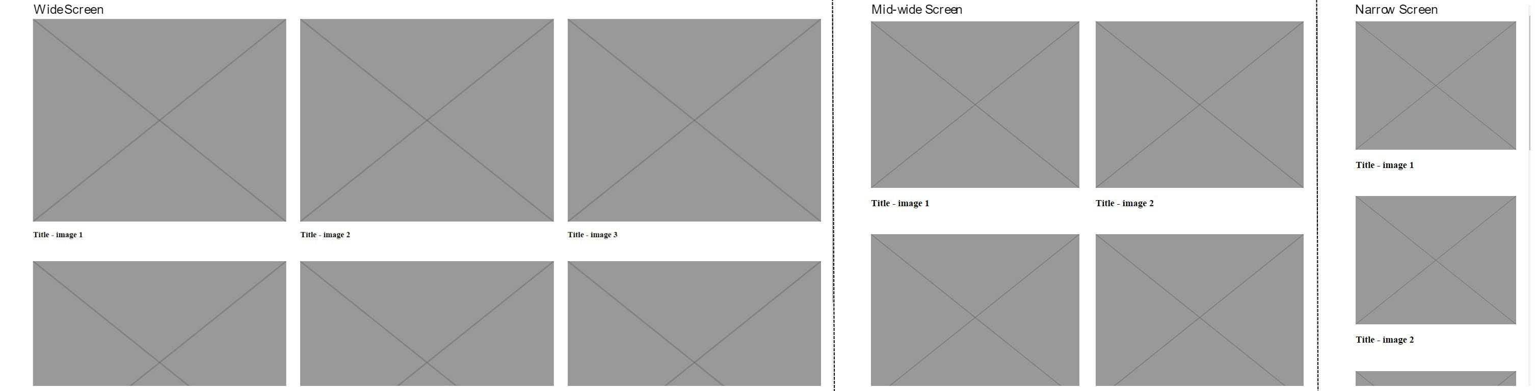
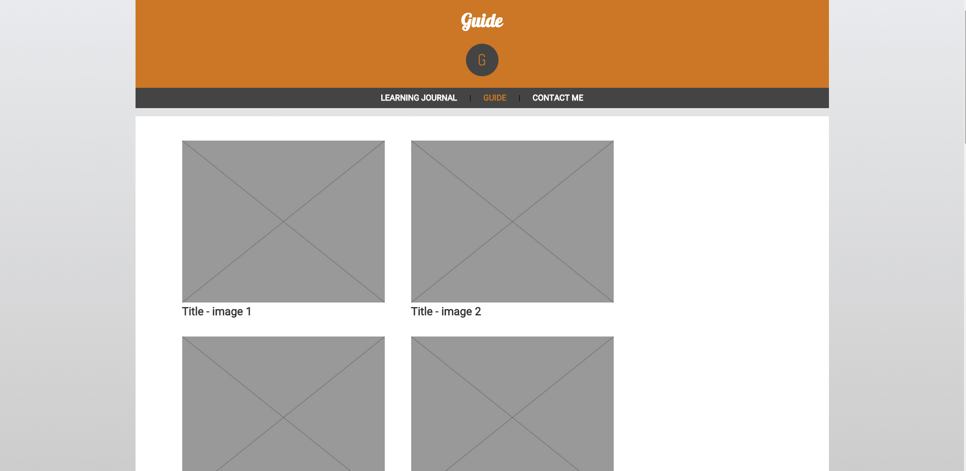
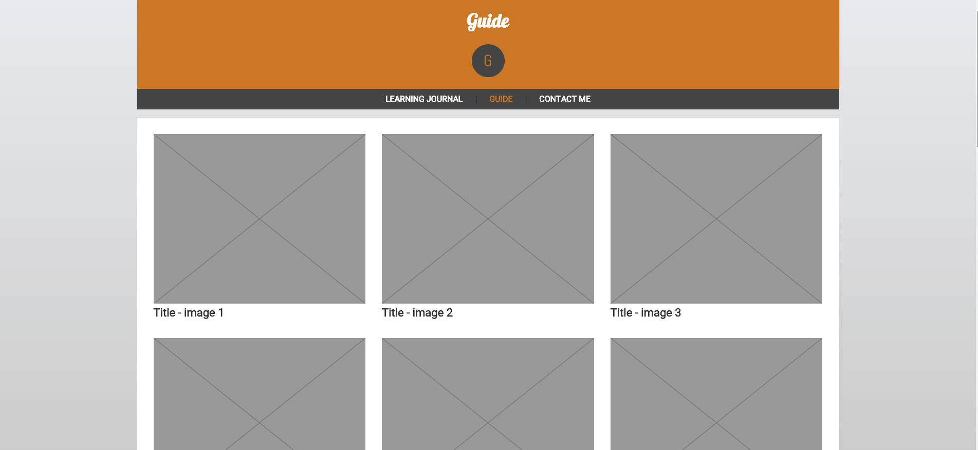
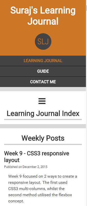

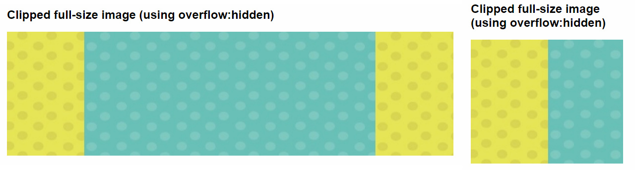
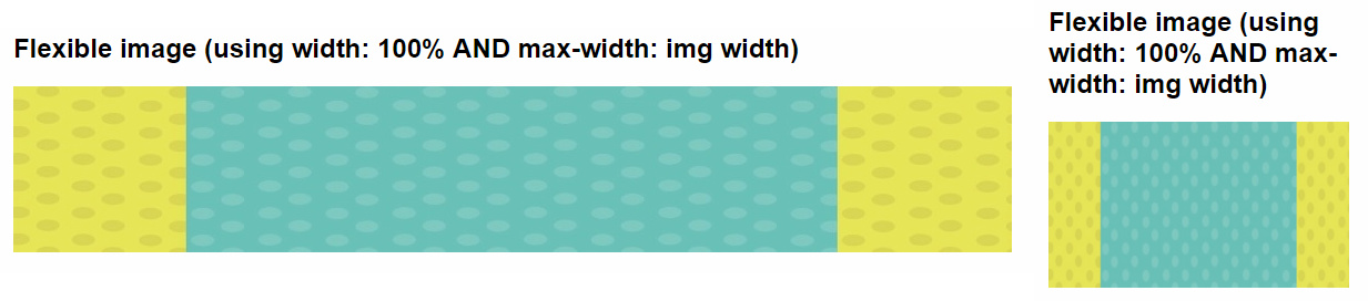
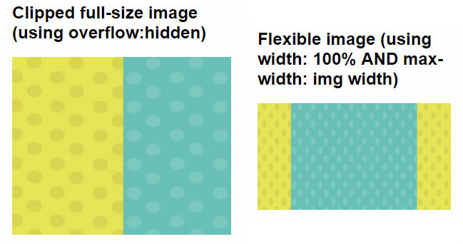
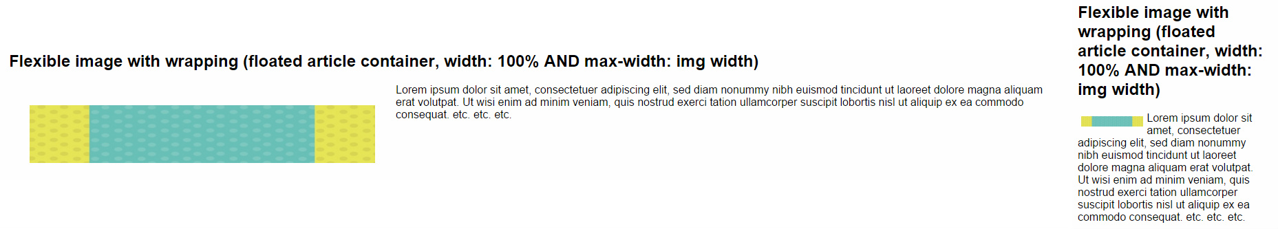
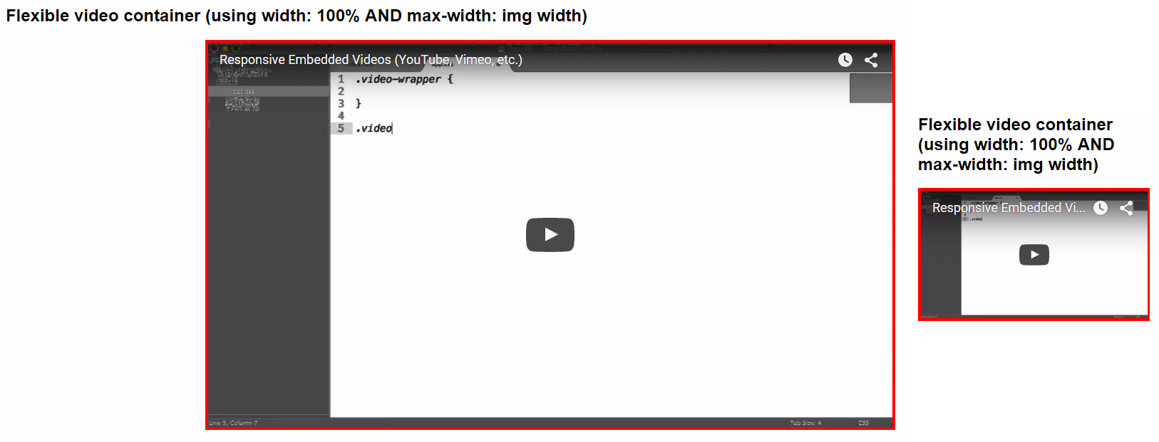

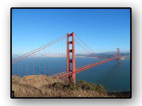
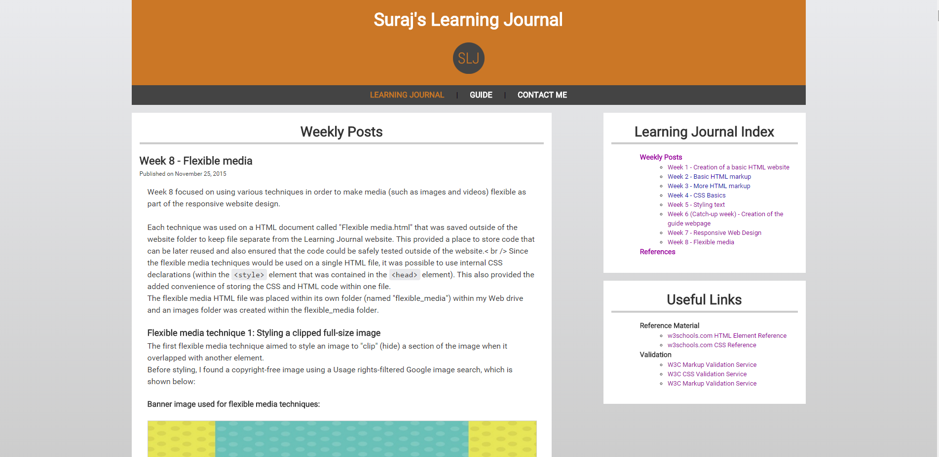
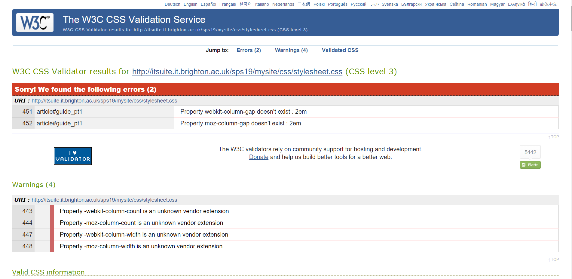
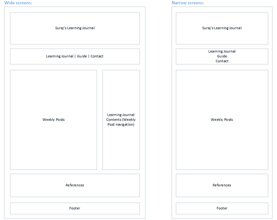
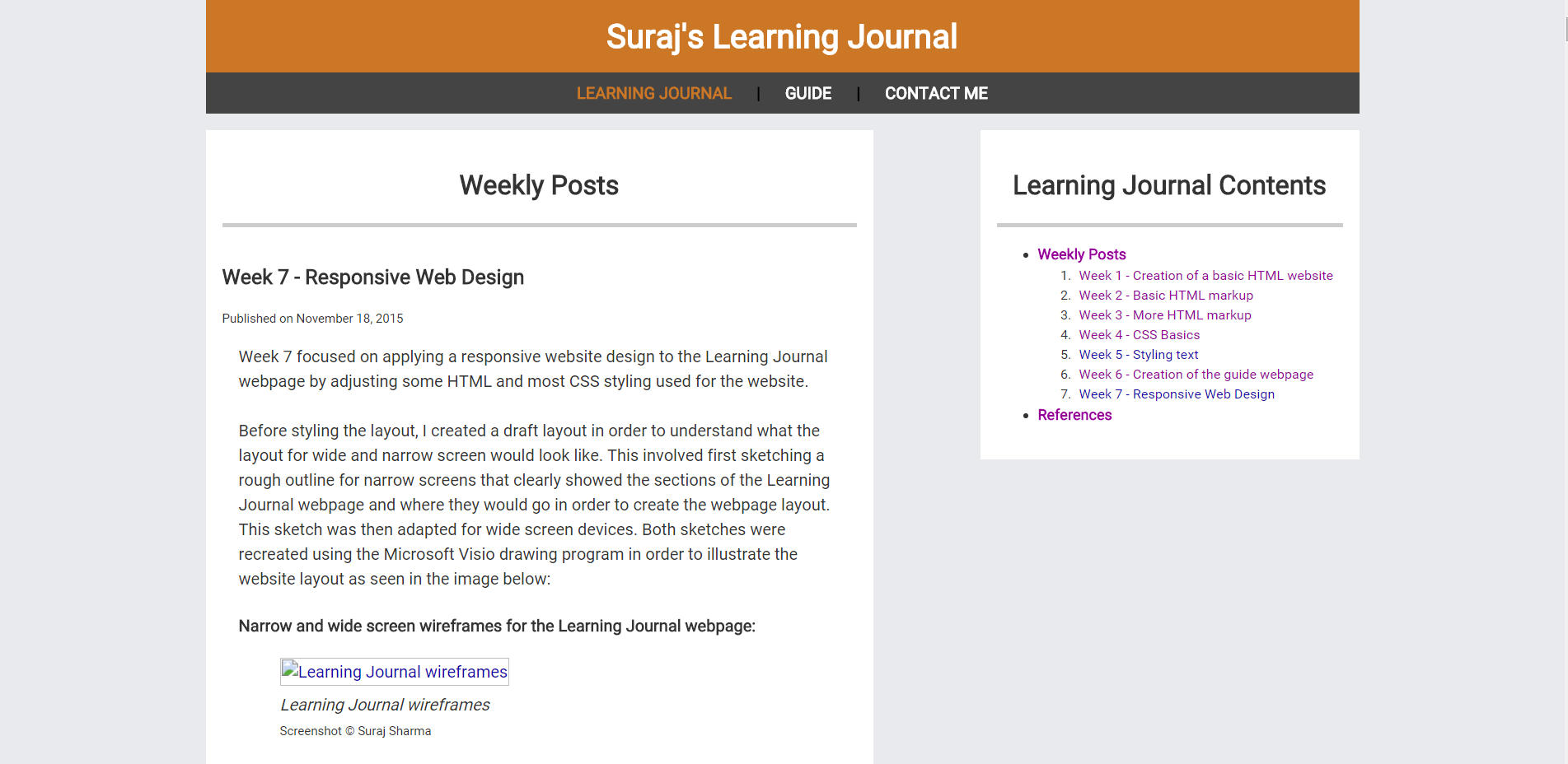
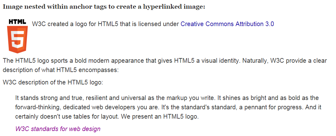